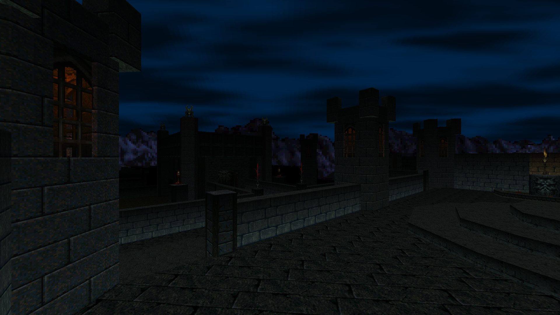
Love for Doom 64 is a quiet but unwavering thing. Rather than fading out slowly over the 25 years since Doom 64’s release, it has only grown stronger. Doom 64 fans are probably the most dedicated and die-hard of the Doom sub-fandoms, faithful for decades to a console-exclusive game they could only play on modern systems via emulation or fanmade ports. Because of how hard it’s been to play, Doom 64 has enjoyed less than %1 the amount of custom content that Doom and Doom II have — by far the biggest reason those earlier Dooms have managed to stay alive and vibrant. Doom 64 has endured solely on account of… well, being Doom 64.
Large-scale projects for Doom 64 are a pretty recent development. There was a Community Chest 64 in 2019 and a 25th anniversary mapjam is currently in development. My own The UnMaking came out in 2020, and again in 2021 for the official Doom 64 rerelease. The rerelease gives me some hope that we’ll see more such mapsets in the future, but so far it’s been pretty quiet on that front.
Before the rerelease brought Doom 64 to the attention of the masses, though, and before any of those above mapsets were conceived — before all that — there was Beta 64.
And long, long before Beta 64… there was the dream of Beta 64.
Beta 64 has existed in some form or another since 1998 — first as a fanciful dream in creator Antnee’s head, but hand-drawn maps followed soon after, and then a work-in-progress build for the old Doom 64: The Absolution “port.” In 2018, Antnee finally realized his dream by releasing 31 maps for what was at that time the most authentic way to play Doom 64 on PC, Doom 64 EX. 20 years in development.
Beta 64’s storied development resonates deeply with me as a kid who started drawing maps for my own imagined FPS campaign back in the third grade. I remember my teacher grabbing one of those maps I was working on during a lesson and ripping it up in front of me. It was the worst grief I had felt to that point in my life. Years before, I was Scotch taping an entire world map together for what I recall being some kind of top-down Zelda-like. I had sketched it out over dozens of sheets of printer paper with letters marking which cave entrance took you to which dungeon interior. One of my earliest videogame disappointments was Turok 3, and for a long time I dreamed of modding Turok 1 or 2 into the sequel I had wanted from the third game.
None of my childhood projects ever turned into real games. Beta 64 did. Admittedly Antnee was a teenager when he began designing what would eventually become this WAD, but still it warms my heart to see it in the light of day. Keep in mind that for many years it wasn’t even clear whether Doom 64 would ever be moddable the way that Doom is, and yet Antnee held onto that chance. Here is the kid from all those years ago, grown up now, realizing the dream he carried with him from his youth. Few things in this world are more beautiful.
“What about the maps though?” I hear you say. “Stop prattling and tell us if the maps are any good.”
They are. Two decades in the works and they ought to be. That much time allows for an outlandish amount of brainstorming and implementation, refinement and iteration. The opposite of videogame crunch culture, where instead of forcing the creativity to flow, long stretches of time can be left to daydreaming and wondering if your muse will visit. The ideas come as they please, in the shower or in the still moments before sleep. And you’re free to throw away concepts that don’t work and return to the drawing board to make them better. It’s creation as it was meant to be (if there is such a thing), free of deadlines and outside demands, and it shows through in the end product.
Let me put it unambiguously: Beta 64 is the finest collection of Doom 64 maps currently in existence — including the original Midway ones.
Antnee’s levels are creative in ways I’ve rarely seen, inventive and diverse like few others, and I mean across all of the Doom mapping scenes, not just Doom 64’s. But from the ground up they were built as solid as can be, long before Doom 64’s scripting and other bells and whistles even came into play.
Anyone who knows me as a mapper knows me for my so-called “gimmick” maps. I cling to those gameplay gimmicks for dear life at times, because I know they make my maps at least interesting and unique, if not good. When I made the jump to Doom 64 in my most recent WAD, that reality remained largely the same. The new scripting system allowed for vast new levels of customization, but ultimately it was all a way of pedaling in more involved gimmickry, not necessarily in better maps.
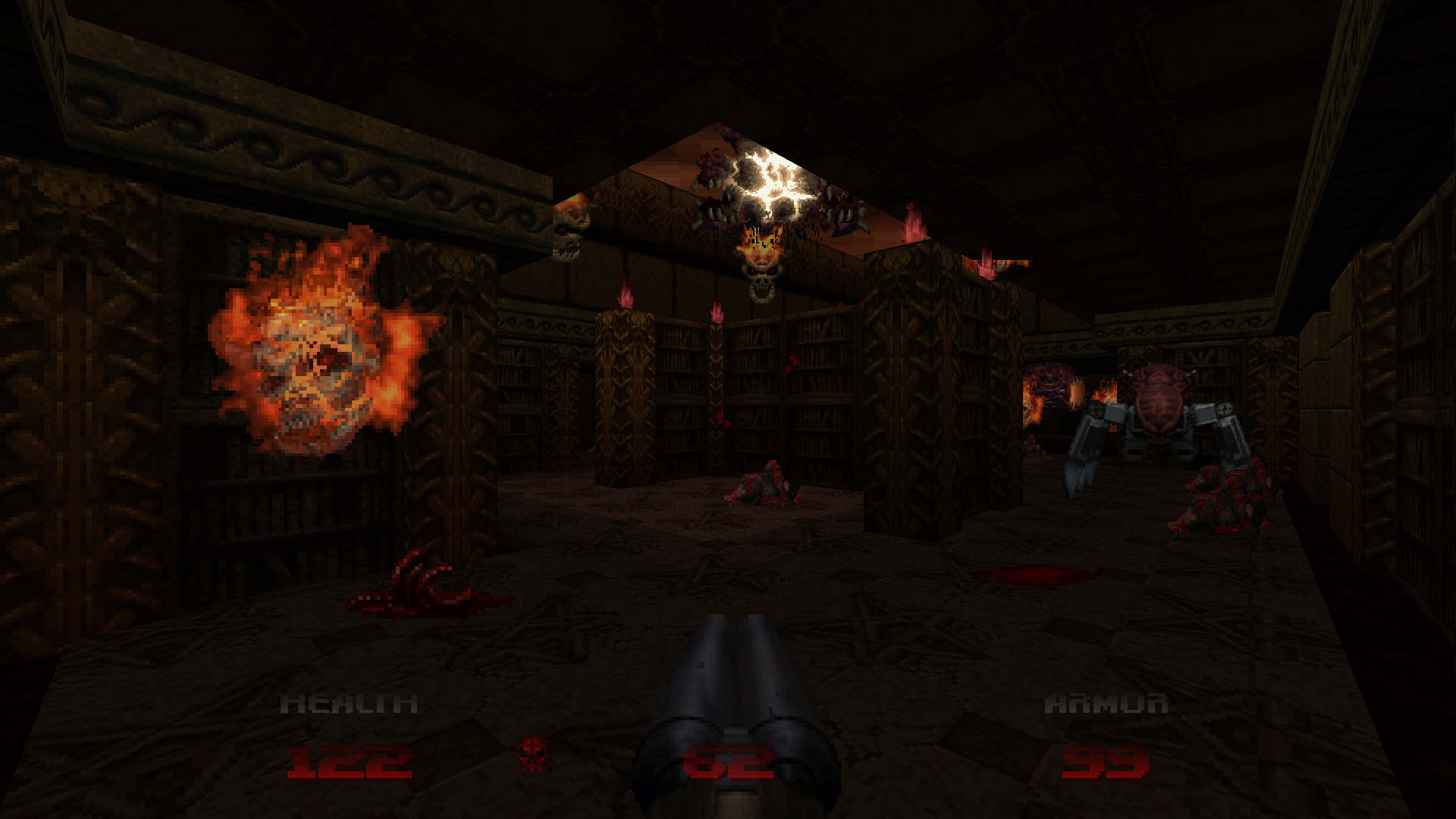
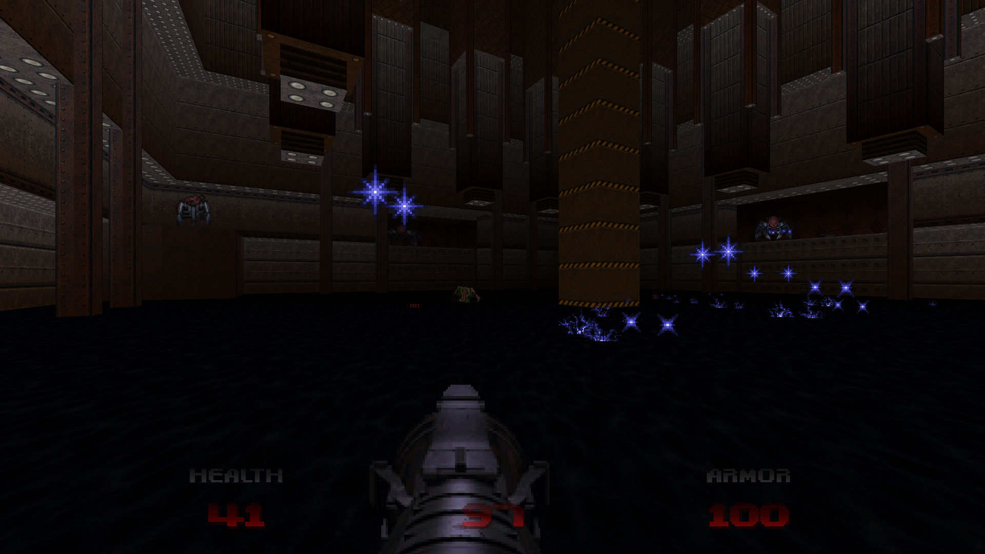
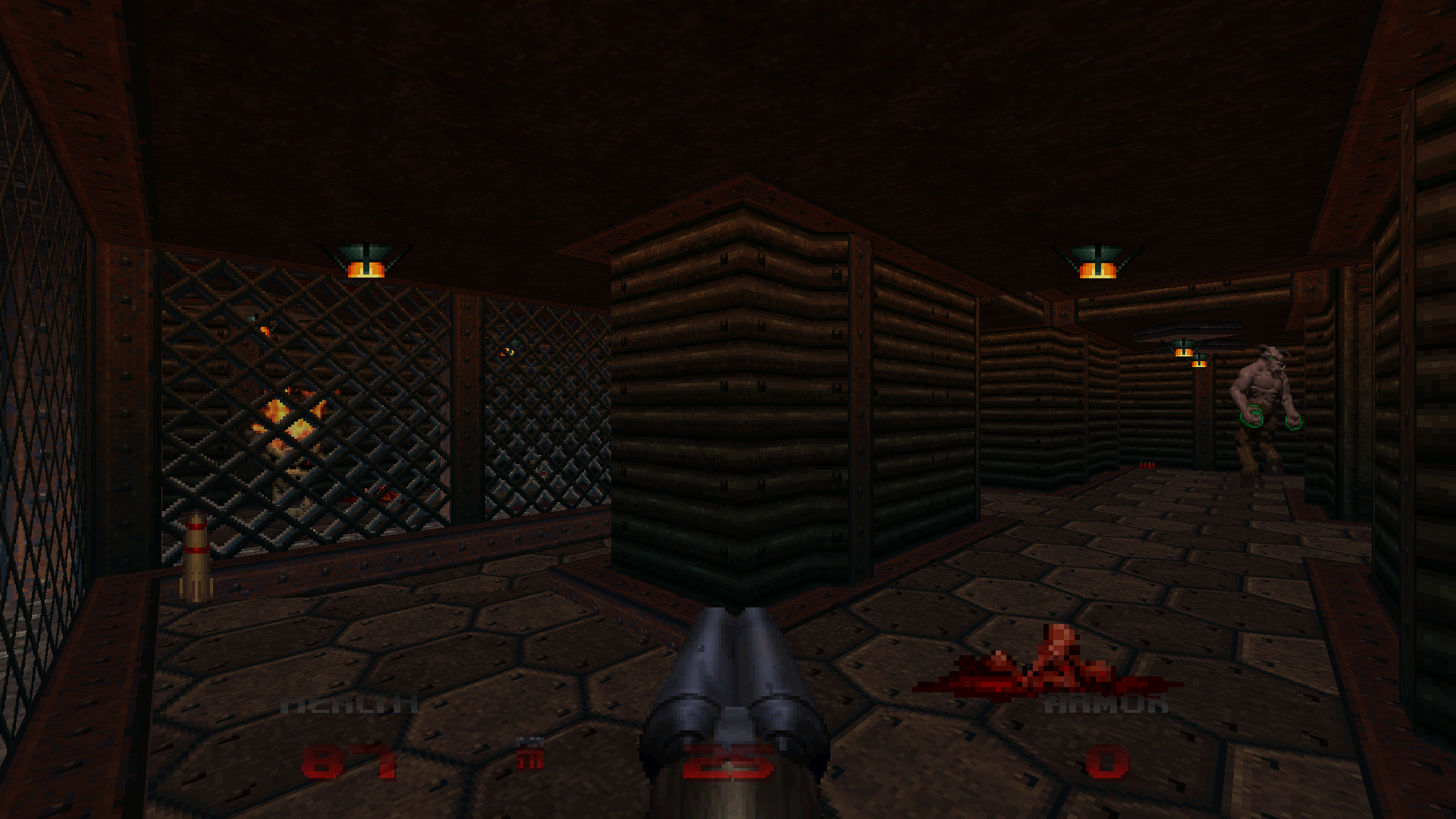
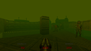
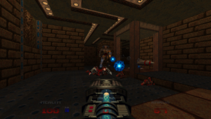
Beta 64, in stark contrast, was made by someone who doesn’t flaunt their cleverness, and who lets the maps speak for themselves. Antnee puts me to shame 31 separate times with maps that are just plain fantastic, first and foremost, with fun little concepts incorporated second. Each one has multiple cool twists or brilliant uses of Doom 64-exclusive features, but it never dwells on them or seems to call attention to the mind-blowing things it’s pulling off. The “gimmicky” design takes the shape of one-off moments that always delight or fascinate, but never linger and demand you be impressed. And not one of the maps in Beta 64 is something you could create in regular old Doom. Scripting aside, just the lighting effects or “3D” tricks with Doom 64’s skybox inject life and dimension that you simply don’t see outside of this strange, obscure game.
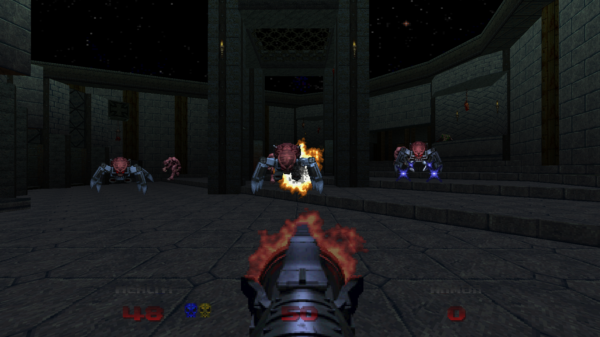
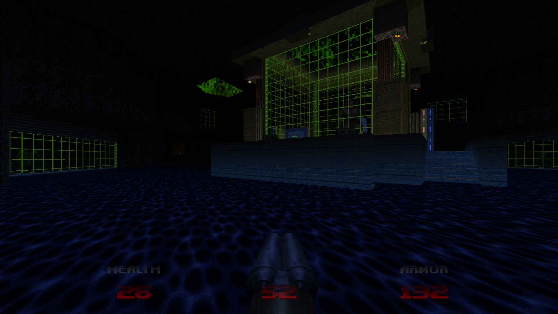
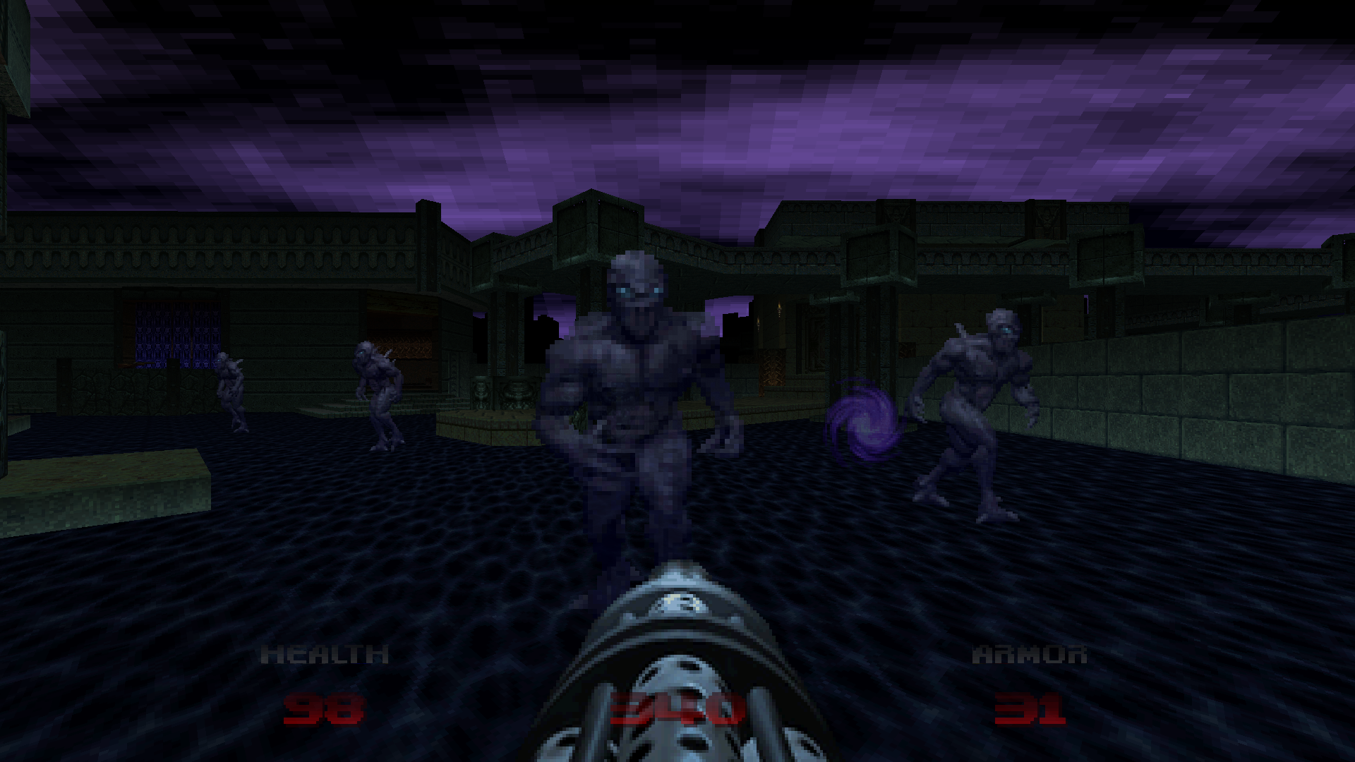
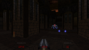
This is a bit in the weeds, but if you’ll indulge me I’d like to dip into Doom 64’s colored lighting system for a moment because I think it helps demonstrate something vital about Beta 64. For every sector you create in a Doom 64 map, you must also define five color values — corresponding to the floor, the ceiling, the upper and lower walls (with a gradient automatically created between them), and one for any objects within the sector. The colors you set are applied as a tint to Doom 64’s otherwise very neutral graphics, meaning that you effectively have an infinite number of color choices and combinations to make your level look any way you like. Compare this to Doom and Doom 2, which both use a single number to determine the sector’s brightness only: dark, light, or somewhere in between.
Obviously, the way Doom 64 does lighting is “superior,” as it handles both brightness and color. It allows for far greater customization and granularity, and a whole new level of mood-setting. At the same time, it’s also a great burden, especially if you’re trying to map relatively quickly as I tend to do. Being able to go from the concept stage to a finished, playable, and even decent-looking map in a few hours is one of the things I love most about Doom. But that’s not the case with Doom 64; if you don’t take your light values seriously your map is going to look bland at best.
With The UnMaking, I pretty quickly settled into a method that streamlined the process a bit. I would choose an initial color that I thought looked cool for the area and this would become the color of the “light source” in that room, coming from either the floor or the ceiling. For example, I might place lamp props on the floor of a big warehouse; in that case the light would be coming from near the floor, so I would use the color I had chosen for both the floor and the lower wall. Then for the upper wall and ceiling I would simply darken the initial color a number of shades. Enemies and items would be given a shade somewhere in between. Ultimately the effect would be that of the lamps giving off a glow that fades off toward the ceiling far above your head. Simple — but reasonably effective.
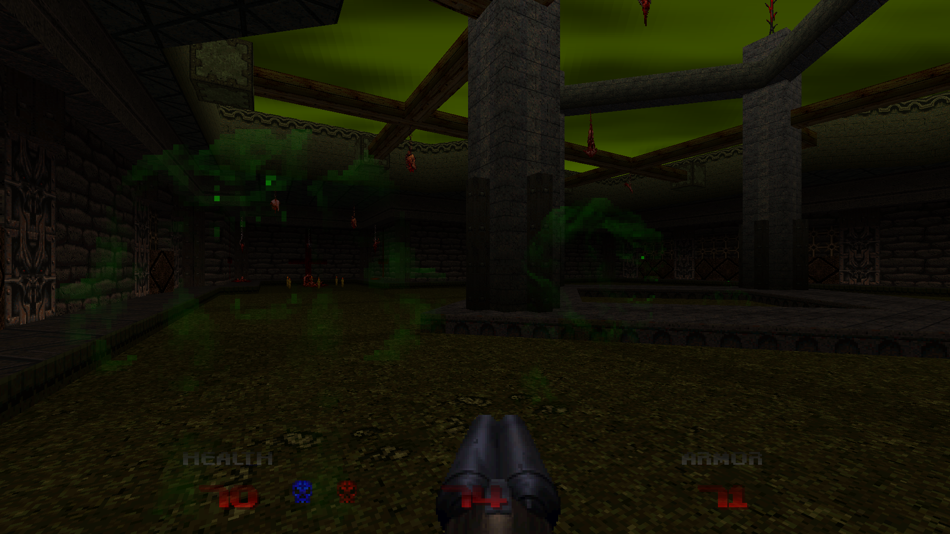
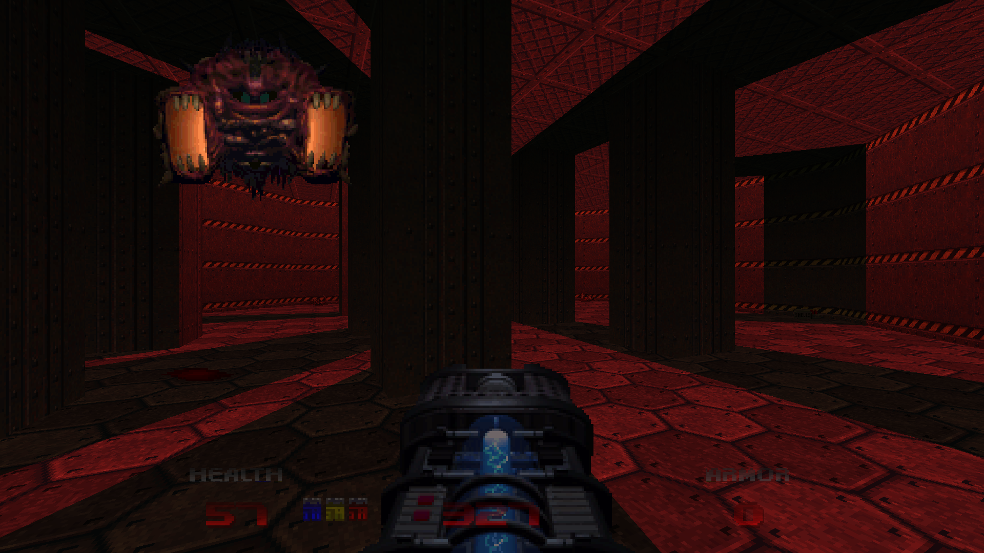
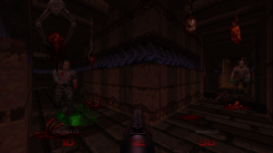
Next to Antnee, I am a child drawing with a half-eaten crayon. Though the key to making the best of your Doom 64 maps might indeed be in thinking of the lighting system more as a coloring system. This is how Antnee treats it, artfully applying colors independent of any concept of lighting, more subtle and nuanced than anything I ever conceived of. A somewhat abstract approach means he can paint the surfaces in any hues he chooses, making them actually read as different materials rather than all being gray concretes and metals tinted by the same light source. And the way that enemies and props are lit doesn’t need to have any relation to the rest of the colors used in that sector.
As I prep The UnMaking for its final release and finish my contributions to the 25th anniversary mapjam, I had planned to quietly swear off Doom 64 mapping entirely. It’s simply too cumbersome and time-consuming for what I want out of mapping, and I believed other projects would be more creatively fulfilling. Now I’m not so sure.
Beta 64 has shown me how much potential there is still left to be discovered in these systems I thought I had explored fairly well. I probably don’t have the same eye for the evocative color combinations that Antnee has, but with more time and attention there’s a lot I can still achieve. Not just related to colored lighting either — but also the macro scripting system, which had seemed so limited before but after playing Beta 64 feels full of possibility. What Antnee does with scripting isn’t restricted to gimmickry; he uses it for all sorts of combat applications, turning the fights ever more unpredictable, unorthodox, and unrelenting.
All I can say is that it’s a damn good thing I didn’t play Beta 64 before making my own Doom 64 WAD. There were at least a couple points where I considered throwing in the towel on The UnMaking. If I had known that such a perfect Doom 64 mapset already existed, I probably would have thrown that towel. Playing Beta 64 now, though, it only inspires me to be an even better mapper. Let’s hope it doesn’t take me 20 years before I release my next project.
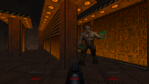
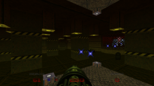
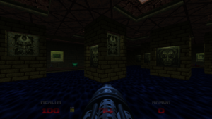
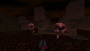
Beta 64 requires Doom 64 EX. And for more awesome WADs, be sure to check these out!
Thanks, this is super flattering and I’m glad you had a good time!
Since you seemed to enjoy the lighting, I’ll comment on that a bit.
Regarding the lighting/coloring, I simply took a page from the original. You’ll find that especially with ceiling/floor brightness in D64, a lot of times it doesn’t seem to make logical sense. The lower wall color is super dark, but the floor it’s connected to is extremely bright?
That doesn’t happen in real life, so when you see it through that lens it’s quite strange. But think about it instead with contrast in mind. The purpose it serves is to immediately distinguish the shape of the area you’re in, and reveal nooks and crannies that otherwise would bleed into the background a bit.
Try making an S shaped hallway type area, and color the lower wall the same as your floor. then color the floor much more brightly. Compare. When your floor matches your lower wall, at first glance your area is a bit of an amorphous blob, and you kinda have to “explore” a bit for it to click.
With a brighter floor, the geometry IMMEDIATELY reveals itself to your brain.
It’s pretty subtle and cool that they did that, and it has the added bonus of giving the map that distinct “D64” look.
Anyway, thanks for playing.
A really good point about the lighting, and I hadn’t thought about it that way. I think some of my rooms probably fall into that amorphous blob trap. Every once in a while it might be useful for hiding a secret, but most of the time your way is much better!
Thank you for taking the time to read! I’ve heard you’re in the midst of some real life excitement. Once things have settled a bit, if you’re at all interested in porting Beta 64 over to the Doom 64 remaster, let me know.