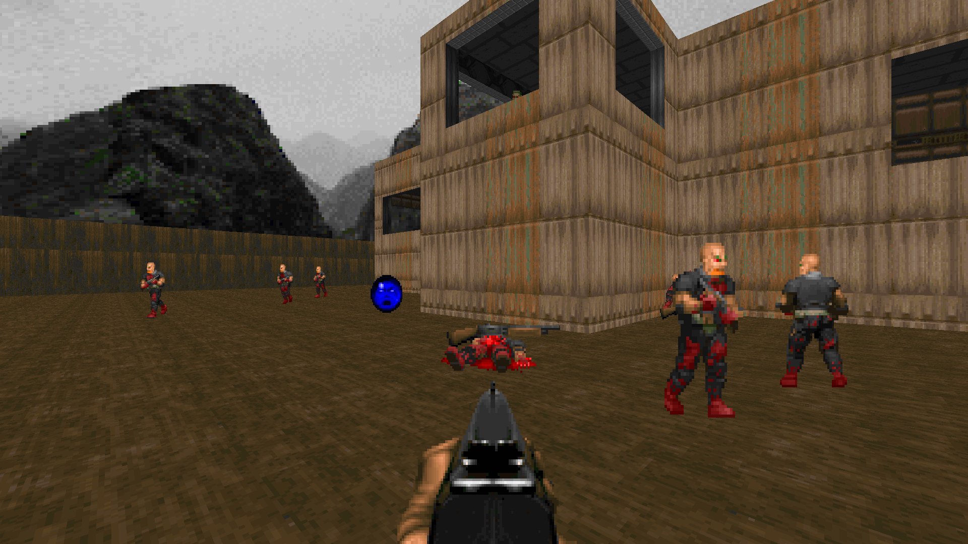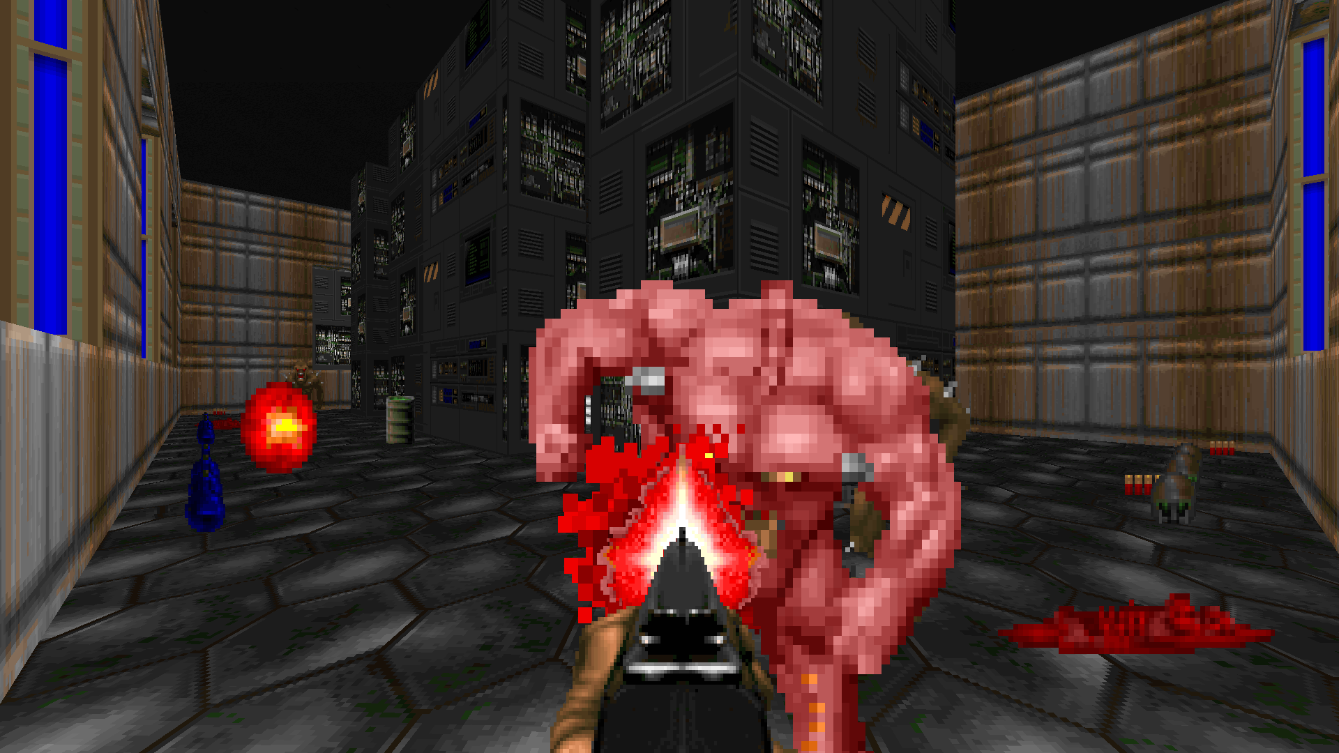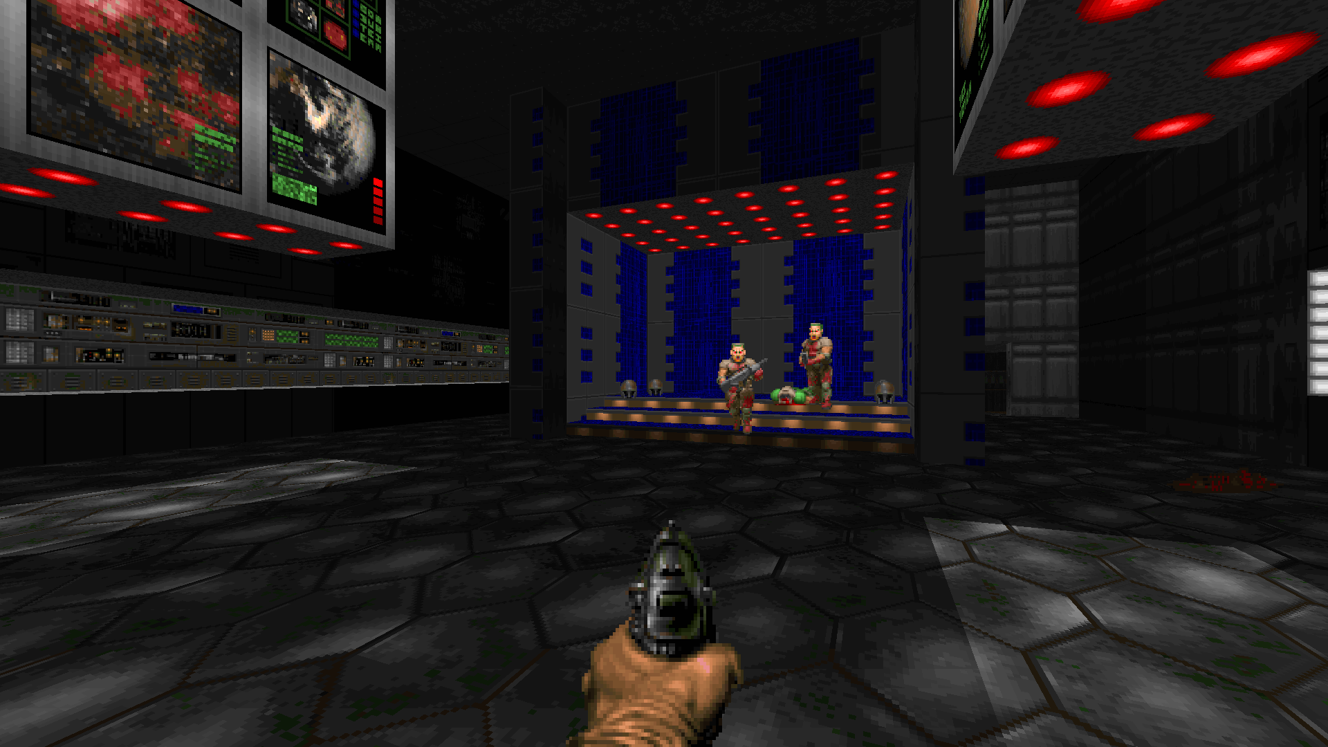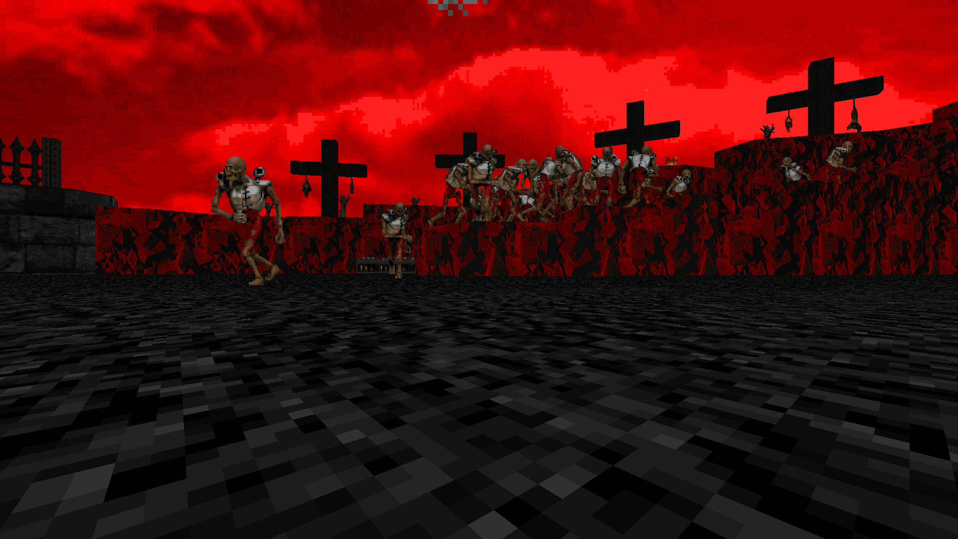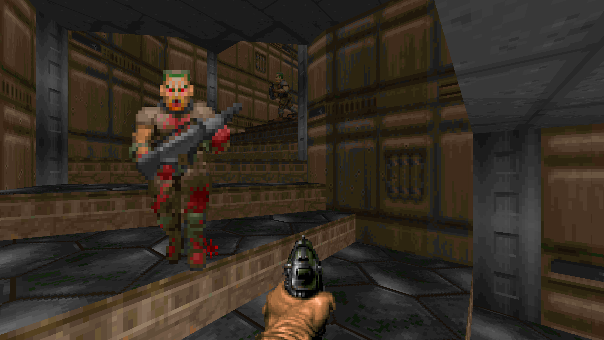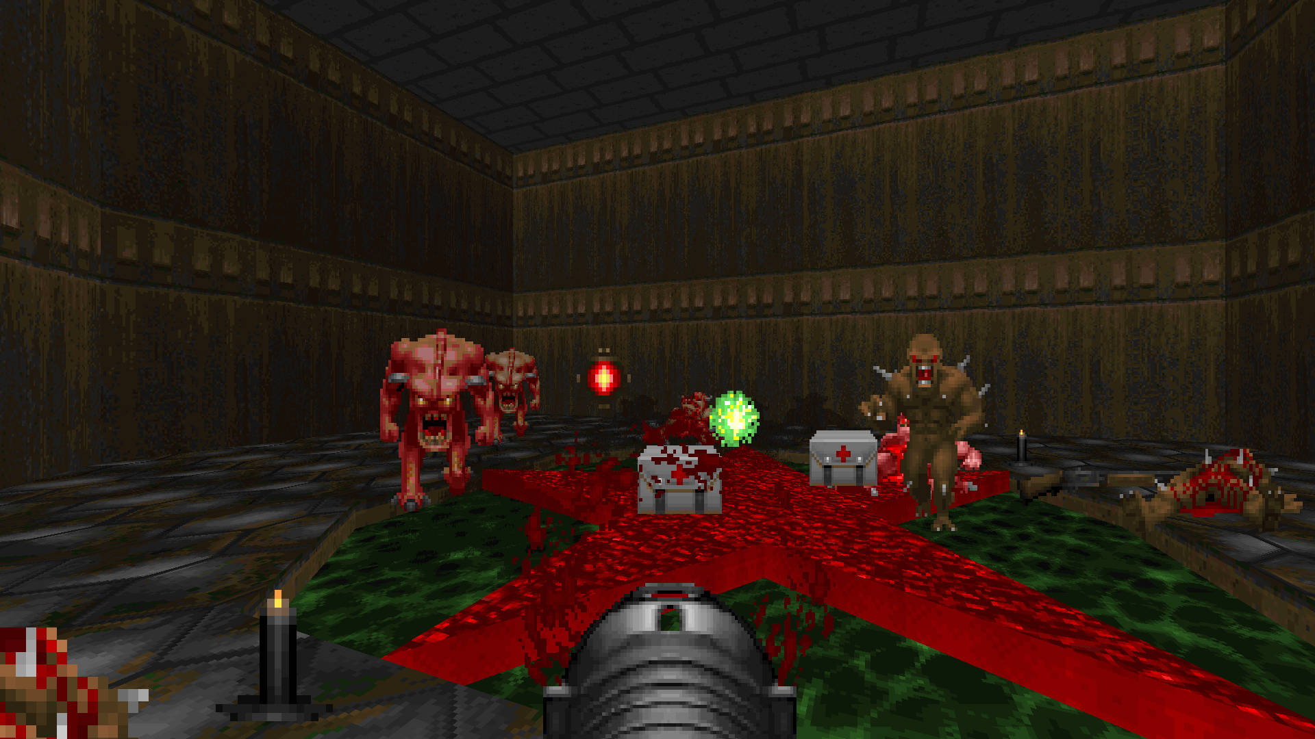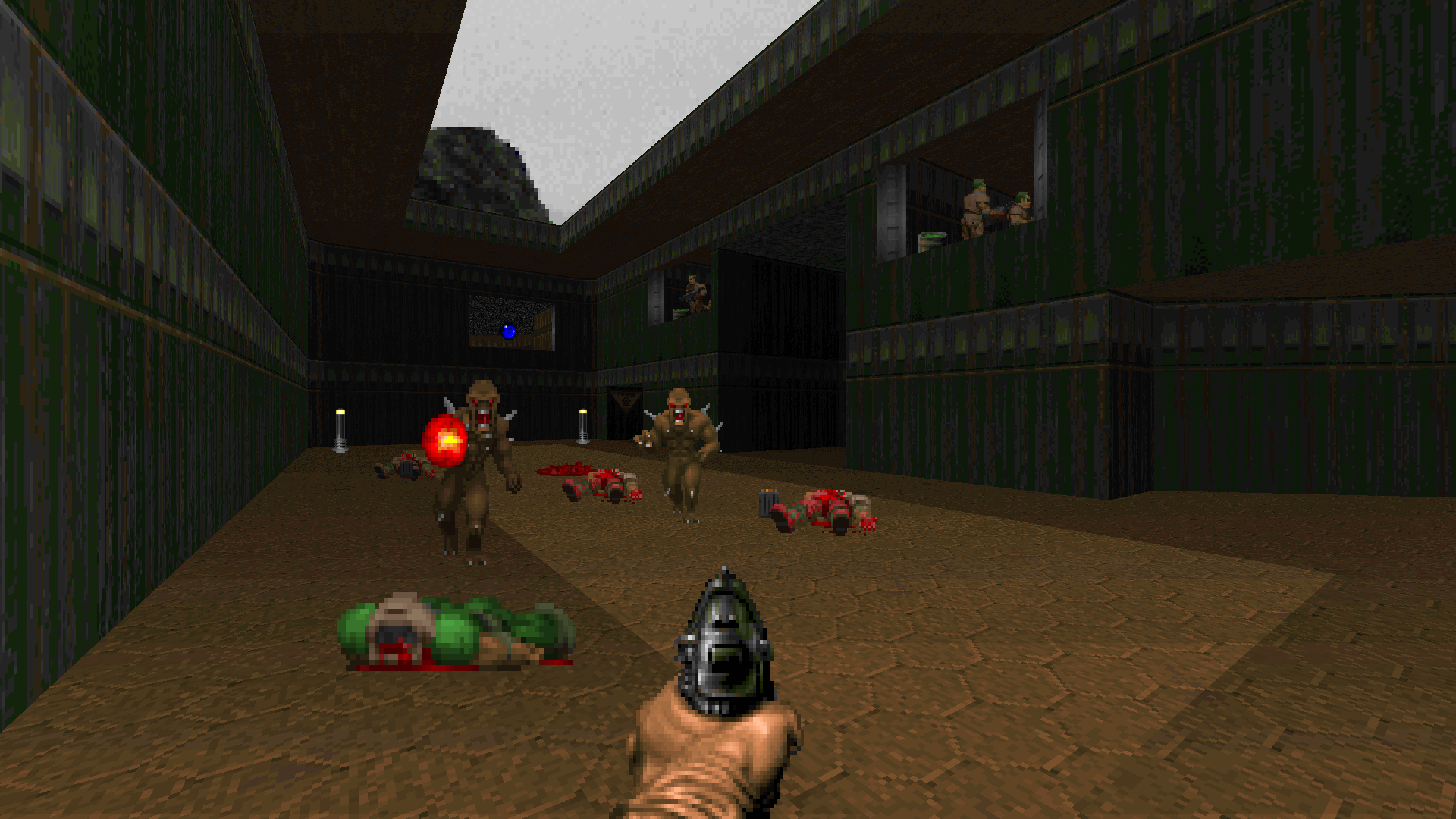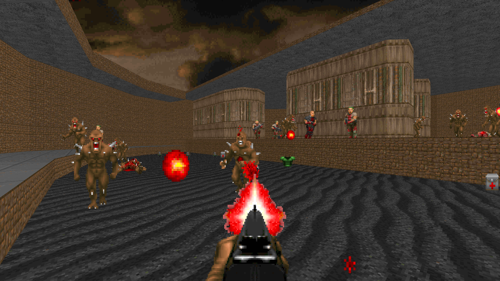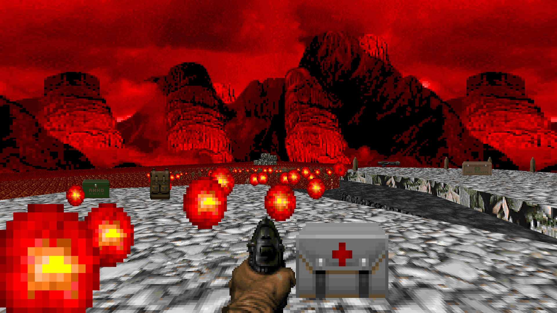
Seven years ago, I had this idea of cataloging my favorite WADs from Doom’s entire history. When I first set out, that history already spanned 19 years. Now we’re at 26 — and I’m looking back to realize that the most obvious WAD of them all still isn’t on this list. Over the course of 50 episodes, I haven’t at any point talked about the one WAD that kicked this thing off; I’ve never reviewed DOOM.WAD.
Of course, everyone else has. In the Year of Our Lord 2020, you can probably find a thousand discussions, reviews, essays, and videos on Doom. You can read up on its development, its engine, its gameplay, its legacy. Just about everything that could be said about how awesome Doom is has already been said. And if you’re reading this, let’s be honest: you’ve already played Doom. So what is there left for me to talk about?
Well, What’s Awesome, Doom? has always been a personal endeavor. This column isn’t “The Greatest WADs as Voted by Committee” for a reason; rather, it’s about the WADs that have meant the most to me and me alone. And there are very few WADs that mean more to me than the original Doom IWAD.
I’ve had a longer relationship with DOOM.WAD than I have with most human beings. I was six years old when I first played it in 1994. At the time of writing this, I’m 32… and still playing Doom. Frequently. Passionately. Religiously. There’s no game I’ve played more, or that I know better. And yes, in most cases these days I’m playing fan-made WADs — but every so often I come back to those original 27 maps again to relive the magic that made me fall in love with this game.
Another thing that’s no secret around here is that I make my own maps. But recently I’ve had a bit of a setback in my mapping efforts. I’ve finished up two major WADs that I’m incredibly proud of, but now I’m just having trouble finding the inspiration to continue with other projects that I had in the works. So I thought maybe now was the time to return to Doom again, or at the very least to its most iconic episode. To go back to where this all started and see why that old set of maps is so important. What did they have to teach us back then, and what do they still have to teach us when our own muses have left us?
The original Doom levels are the result of three competing creative visionaries — John Romero, Tom Hall, and Sandy Petersen — who I like to think of as the Kirk, Spock, and McCoy of Doom. It was Tom Hall who was the first to take a swing at making maps, and his are very flat, orthogonal, sensible. They’re almost believable as real military bases. Petersen came in late in development and scrambled to put the finishing touches on. He improvised, shot from the hip, and cared more about the feel of a map than its look or logic. But Romero — Romero sits right in the middle, a happy medium where gameplay and aesthetic converged. Knee-Deep in the Dead is almost exclusively his work, and so my original impression of Doom was his brilliant, balanced mapping style.
It seemed suitable now to return to his episode with truly critical eyes. To really appreciate Romero’s craft and inspect how he did what he did. And to use Knee-Deep in the Dead as a mirror to reflect on my own work. Here are five lessons I took away from my latest playthrough of Doom’s first episode:
1. The Learning Curve Is a Flat Circle
Of course, we begin our journey where Romero finished his. E1M1 is the last map that he designed for the original Doom. He knew that the opening moments of a game needed to hook the player, and so as a designer you wait until you’re at your most experienced with the tools and the resources — until you’ve come as close to mastering your craft as possible — to create that introductory level.
We’ve all played E1M1 so many times it’s easy not to notice how masterful it really is. Do we appreciate the incredibly tight design, the codification of so many Doom tropes? Even the smallest details might not exist had Romero tackled this map earlier on. The way the light blasts through the window of the nukage room but leaves the corners darkened realistically? Romero figured that trick out in the process of making the maze section of E1M2. Do we understand how powerful it is to be able to look out a window and across the map — to see our destination long before we reach it? That’s something I’m sure he first hit upon with E1M7. Would these little touches exist without E1M1 coming at the end of the development of Doom?
I’ll admit that even though I knew this particular Romero lesson well, I’m certainly guilty of not taking it to heart. It’s a different animal when you’re not a professional level designer, not switching from one game to the next every few years, from one engine and set of mapping tools to another as soon as the previous project ships. I think experienced Doom mappers like me sometimes think we’ve spent so many years with Doom and Doom Builder (or your editor of choice) that we’ve learned all there is to know; that we don’t have much room to develop our skills over the course of a single project.
We’re so wrong to think that.
You’ve heard the platitude, of course: “There’s always room for improvement!” But more than that, we really ought to look at each creation as its own learning curve. My goal for each project is different, after all. Each involves a different style or resource pack to master. And in many cases I go in with a specific aspect of mapping I want to focus on and get better at. So how could I possibly expect the first map I make to be just as good as the last?
However large or small it may be, I do believe that there’s always a notable change in quality between the initial work I do on any mapset and the work I’m putting out by the end. UnNecessary is a perfect example, with 32 maps designed almost completely in numerical order from 01 to 32. I can pick out maybe two or three maps in the first half that really stand out, while the last episode is full of some of the more interesting premises I think I’ve ever done. But do most players suffer through the first 10…15…20 maps to get to the good stuff? No! — nor should they. It’s absolutely on my shoulders as the designer to sell my creation as best as I can from minute one, not on the player’s shoulders to trust that the maps will eventually get better.
One change I’ve made for the WAD I’m currently working on is to have a sort of placeholder in the MAP01 slot. It’s not so much a work-in-progress map as it is a playground for ideas. Any time I think of something cool that doesn’t necessarily have a place in the map I’m working on, there it goes in the playground. If I want to test out a concept — into the playground with it. When I’m ready to actually create the introductory map of the set, not only can I pull all the best elements from the work I’ve done on every other map up to that point, I also have a playground already full of toys to start from. There’s no way to guarantee that my MAP01 will be the best map in the WAD, but I can at the very least try to ensure that it isn’t the worst.
Never underestimate the growth you’ll make over the course of a project.
2. Hurt Me Plenty? Never Heard of Her
I thought it would be interesting this time to take a look at the way Knee-Deep in the Dead is balanced on the Hurt Me Plenty difficulty rather than on Ultra-Violence. I probably hadn’t played the original IWAD on HMP since 1994, and it was a shocking revelation how different the experience is.
Did you know there were no shotgunners on E1M1 or E1M2? How about spectres? — when do you think they first appear? Spoiler: it’s not until E1M5! The most shocking part is that Knee-Deep in the Dead feels way better this way. Not in terms of difficulty, certainly, but in the way it ramps up over time, with new enemies more gradually drip-fed over the duration rather than front-loaded mostly in the first map. That sort of tipping of the hand early on, so to speak, is something that has forever bothered me about many custom WADs (and even Doom II’s base maps), and I’ve definitely railed against it in the past. In contrast, Doom seemed to me to have gotten it mostly right by holding back on demons and spectres until E1M3 — and reserving lost souls, cacos, and barons for the later episodes. But what I never realized was how perfectly-paced Knee-Deep in the Dead actually is if you just lower the difficulty a notch.
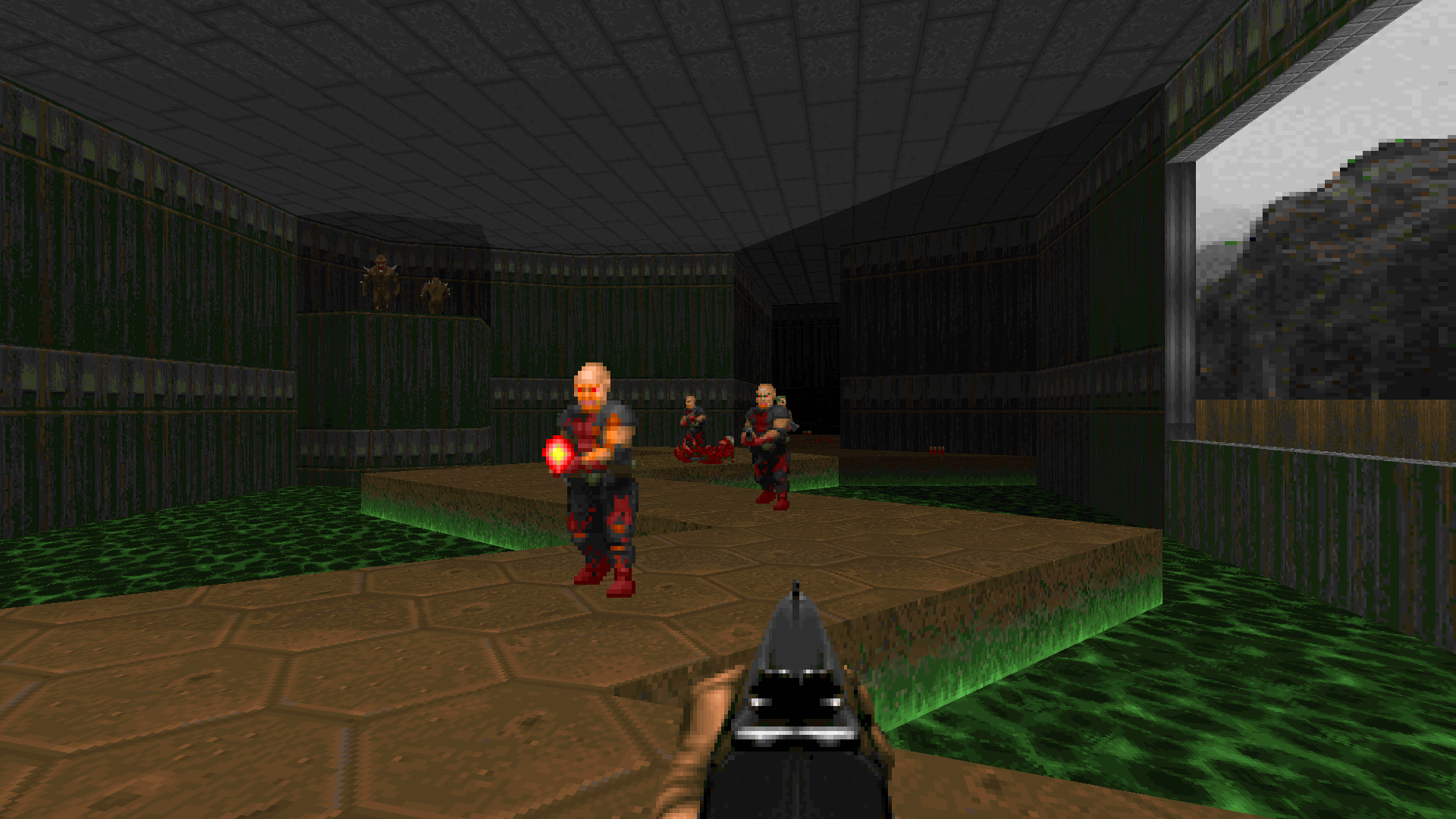
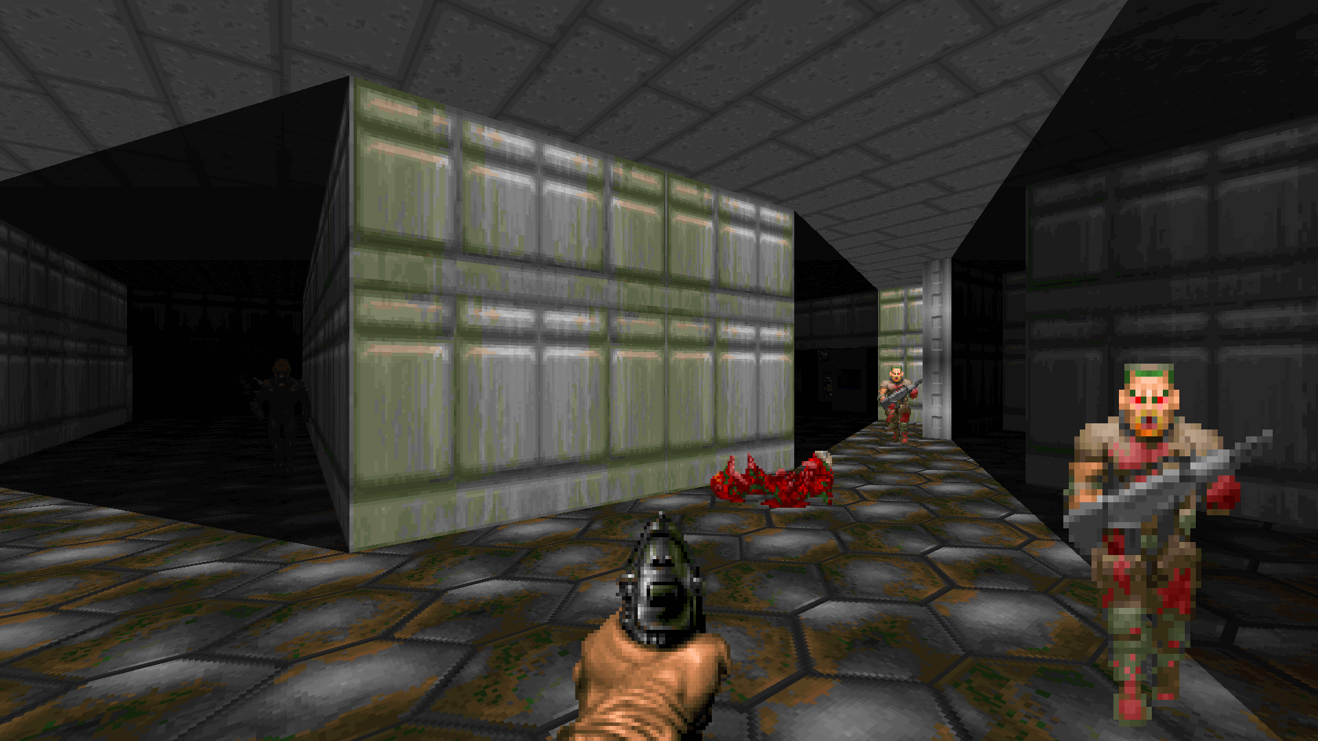
On HMP, E1M1 eases you in with exactly two enemy types: the zombie soldiers and hellish imps. One is an extremely weak hitscanner while the other is a little tougher but with a projectile that can be evaded. These are the primary two kinds of attacks you’ll be worrying about for the rest of the game. Perfect, so now what? Well, E1M2 pits you against those same two enemies, just in much greater numbers. After two maps of them, you should be pretty familiar with the basics of combat. So then by E1M3 we’re ready to reveal the much more dangerous hitscanner as well as a real meat-shield of a melee enemy. Then when you’ve got the hang of all that, it’s time for one more addition in M5: an enemy variant that you have to be extra vigilant to even see coming.
You may have noticed I think about this pacing stuff a lot. I consider it one of the most important balancing acts in map design; on one hand you risk boring the player by not giving them enough new stuff to play with, and on the other you can easily overwhelm them by throwing out too much content from the start. And that’s not even considering the sense of progression and increasing danger that can be created through careful introduction of new enemies and the weapons to deal with them.
But you know what I don’t think enough about? Difficulty settings.
Having played through Knee-Deep in the Dead on HMP, I think I can safely assume the episode was designed and balanced with that skill setting in mind, and that not much thought was given to the additional enemy placements on UV. Especially on the early maps, that boils down to essentially a ton of extra shotgunners and spectres thrown in wherever they’d fit.
I’ve long done difficulty settings pretty haphazardly myself. I tune my maps for HMP while I’m building them and then tweak them a little harder or a little easier for UV and HNTR. A quick UV balancing might be to double up on some enemies here, replace some zombiemen with shotgunners there, swap out a bunch of demons for spectres and… done! I’ve known full well that this is just not good enough, but I’m usually so burnt out on a map by the time I get around to the difficulty settings that I want to be done as soon as possible and move on to something else. Not a particularly inspiring mindset, but there you have it. And there are plenty of problems that result from treating your balancing phase this way.
Of course there’s the concern about pacing, which I think Knee-Deep in the Dead really highlights. If you want to make an area harder by throwing in, say, a baron of hell, consider what you’re doing to the pacing of your WAD. Does it mean barons will be introduced earlier than intended? How much earlier? Are you okay with that? Or did you maybe have a cool setpiece or arena where you wanted them to first appear? Really think about that stuff, as trivial as it may seem to those of us who’ve been playing Doom for 25 years and have killed barons by the hundreds and thousands. Pacing your reveals is still important.
Another problem is that the additional enemies may not add much to an encounter. So you threw a handful more imps into this trap; okay, but imps are easy enough to strafe around and pick off with a shotgun. Have you actually made the trap more difficult or have you merely asked your player to spend another 30 seconds circling the edge of the room and pumping away mindlessly on their boomstick? Bigger hordes of tougher monsters seem like a no-brainer for upping the challenge, but if the encounter isn’t interesting and doesn’t account for the beefier opposition, it can come out as a zero sum game. At worst, bullet-sponge enemies can make your fight boring.
In my estimation, the greatest danger when it comes to calibrating difficulty settings comes in the form of not making them easy or hard enough. I believe I’m in the minority as a mapper who balances first and foremost for HMP, whereas most players immediately default to playing on UV. It’s rather telling that the most frequent feedback I get is that UV isn’t hard enough. On the other hand, for me as a player of other WADs, it’s often the opposite: I start playing on UV only to find it too difficult. So I switch to HMP and it’s still too tough for me. HNTR? Same damn thing.
The importance of giving players room to adjust the difficulty up or down can’t be overstated. Yet in a lot of cases we do most of our balancing for ourselves. Maps are designed primarily to be playable by us, the designer, with some minor tweaks up and down for other settings. The failure, I think, is in testing. If I’m a pretty average Doom player, I can probably get away with balancing HMP for my skill level. But then I need to make sure that UV is significantly harder — and I need to have a better player than me test it out to see if it meets that standard. The same goes for HNTR. I seriously doubt many among us are equipped to adequately gauge the difficulty of all three settings by our lonesome.
If I want my maps to be playable and enjoyable for as many players as possible, that means considering the difficulty settings as more than an afterthought. And to make sure we do the job right, we need testers of all skill levels.
3. Doomguy Can’t Look Up
I don’t care what your fancy new sourceports let you do. In the Doom I know, Doomguy’s neck just doesn’t bend that way.
Doomguy’s personal shortcomings aside, there’s a well-accepted fact among game designers that your players hardly ever look up even when given the ability, and it’s actually quite a chore to get them to notice things above their head. That wouldn’t have been common knowledge in the early id days, but I get the sense Romero intuited even back in 1993 that players wouldn’t be paying too much attention to the ceiling details in his maps.
I’m willing to bet when you think back on Knee-Deep in the Dead you can picture in your mind the zig-zag walkway from E1M1. Or the formerly-a-swastika in E1M4. How about the star teleporters on E1M5 and M9? But can you remember the ceilings that accompanied those floors? If you’re anything like me, the answer is a resounding no. We just don’t spend nearly as much brain power noticing what’s going on on the ceilings in Doom, and that was even more true when we physically couldn’t tilt the camera up or down. Romero, consequently, put very little time into detailing them.
With the exception of the occasional spot where he’s creating some big attention-grabbing light fixture, Romero makes his ceilings extremely plain. There’s not a whole lot going on up there in terms of sector detail, and in general he seems to just choose a flat and plaster it across the entire surrounding area he’s working on. When he moves on to a new area, he might pick a new flat but then he’ll flood-fill with that one just the same. There’s precious little variation at all to the texturing that goes on across Knee-Deep in the Dead’s ceilings.
SCWIBA’S FUNTIME TRIVIATIME:
There are 200 sectors in E1M2 and 96 of them have CEIL3_5 for a ceiling flat. Wow! That’s 48%!
To put it a little more crassly, Romero couldn’t give two shits what his ceilings looked like for the most part. And who am I to complain? I didn’t even notice until now, going on 27 years after the game came out.
I’m reminded of my buddy Jayextee‘s mapping rule that a sector’s ceiling should generally be darker than its floor because the floors are where the player’s attention should be. And it’s worth noting: the most frequently used ceiling flat in Romero maps? Yep, it’s that dark gray brick one, CEIL3_5. At the same time I’m also reminded of the big trend in Doom mapping somewhere around the earlier 2000s where mappers were creating these insanely detailed light fixtures in the ceilings of their maps as a way of cramming in extra visual interest (the ceiling being a better location for detail than the floor, where it could interfere with player and monster movement). That trend never sat well with me and I don’t think I fully understood why until now.
See, the game designer wisdom about players not looking up is true. The eyes of the player are generally glued to where the action is happening, and hardly any action happens near the ceiling. So — what, really, is the function of those fancy ceiling lights or any other hyper-detailed fixtures up there? To be inorganic wastes of resources at best and overdesigned distractions at worst?
Don’t get me wrong; I’m not suggesting you ignore your ceilings or cut that grand techno-chandelier you were planning on putting there. This isn’t about telling you what you should and shouldn’t do. Your map is your space to do whatever the heck you want. I guess the lesson here is this: if you don’t quite know what to do with a ceiling… or you’re stressing over what texture or unique feature will set this this ceiling apart from that ceiling… just remember that the majority of players aren’t going to pay any attention no matter how beautiful you make it. Don’t worry so much. We can get away with saving a lot of our sectors and linedefs for geometry at eye level, especially in vanilla maps where visplanes and drawsegs are a precious resource.
Focus your efforts first on the details that your players can’t help but notice.
4. Research? In My Phobos Lab?
This one is admittedly a stretch, so stick with me. But knowing the story of Doom’s development, I can’t help thinking of all the preliminary work Tom Hall put into things like the Doom Bible, not to mention at least ten different maps that were eventually dragged over the finish line by Romero and Sandy Petersen. I can’t help thinking of the actual research Hall put into the game in its earliest stages — research into real-life military bases so that he could translate the look and feel of them into Doom’s levels. Romero’s style did win out in the end, and Petersen may have taken things in his own wacky direction, but Doom’s aesthetic began with Tom Hall. I don’t think it would look the way it does without his influence from the very beginning.
Hall has never gotten enough praise for his contributions to Doom. Even during development, his maps were supposedly seen as inferior to Romero’s on all counts. The research he had done resulted in maps that were too flat, too boxy, too plain — too much like boring old reality. But I don’t see it that way at all, and the more I play them the less I can understand that perspective. Hall’s maps ground Doom in a way that Romero’s and Petersen’s don’t. They give the moonbases of Phobos and Deimos just enough of a sprinkle of realness that, if we allow ourselves to get caught up in the illusion, our brains will fill in the missing details and let us believe we’re really there… alone against alien forces on the dead moons of Mars.
Even the early versions seen in the Doom alphas, well before Romero and Petersen had put the finishing touches on them, Hall’s maps are hardly the “boring” designs you hear about from the stories. What they are perhaps is more open and nonlinear, more mazelike — but they’re just as iconic as any other, with virtually all the recognizable features of the final maps implemented already. By Romero’s own admission, little work needed to be done on most them besides some simple retexturing. So what we got in the final product were Tom Hall maps, just with a new coat of paint. And those maps are some of my personal favorites: E1M4, E2M2, E2M4, E2M7, E3M7… even Doom II’s MAP10.
Okay, okay. That’s it for my spiel about how underappreciated Tom Hall is. The actual point here is that he did research going into Doom’s development and in my opinion it paid off. Little of the payoff for that research remains in the final product, but it adds something almost intangible… yet profoundly important just the same.
No matter how outlandish or unrealistic your project, bit of research can’t hurt. Maybe you can look into different styles of real-world architecture for mapping inspiration, or peruse old art books for the alternate ways we imagined the future. You could explore obscure weapon designs to add an unusual flavor to your arsenal, or pick up a magazine about weird bugs and sketch out your alien species using features you find there.
I’m even doing “research” for my latest project: learning about color theory! You know, that stuff we were taught in grade school art class and then promptly forgot? Complementary colors and all that jazz? For the last few months I’ve been looking at how other games and films light their scenes, what different colors can signify or how they can play off each other. I’ve especially latched onto retro and indie games that make the most out of very limited color palettes by using vivid and contrasting colors. And most importantly, I’ve been saving screenshots of any interesting color schemes so I can refer to them later.
Truth be told, none of this color stuff is anything I’d given much thought to while mapping before, especially since Doom’s textures have their colors already baked in. How much can you really play with color using the default texture set? Well… more than not at all.
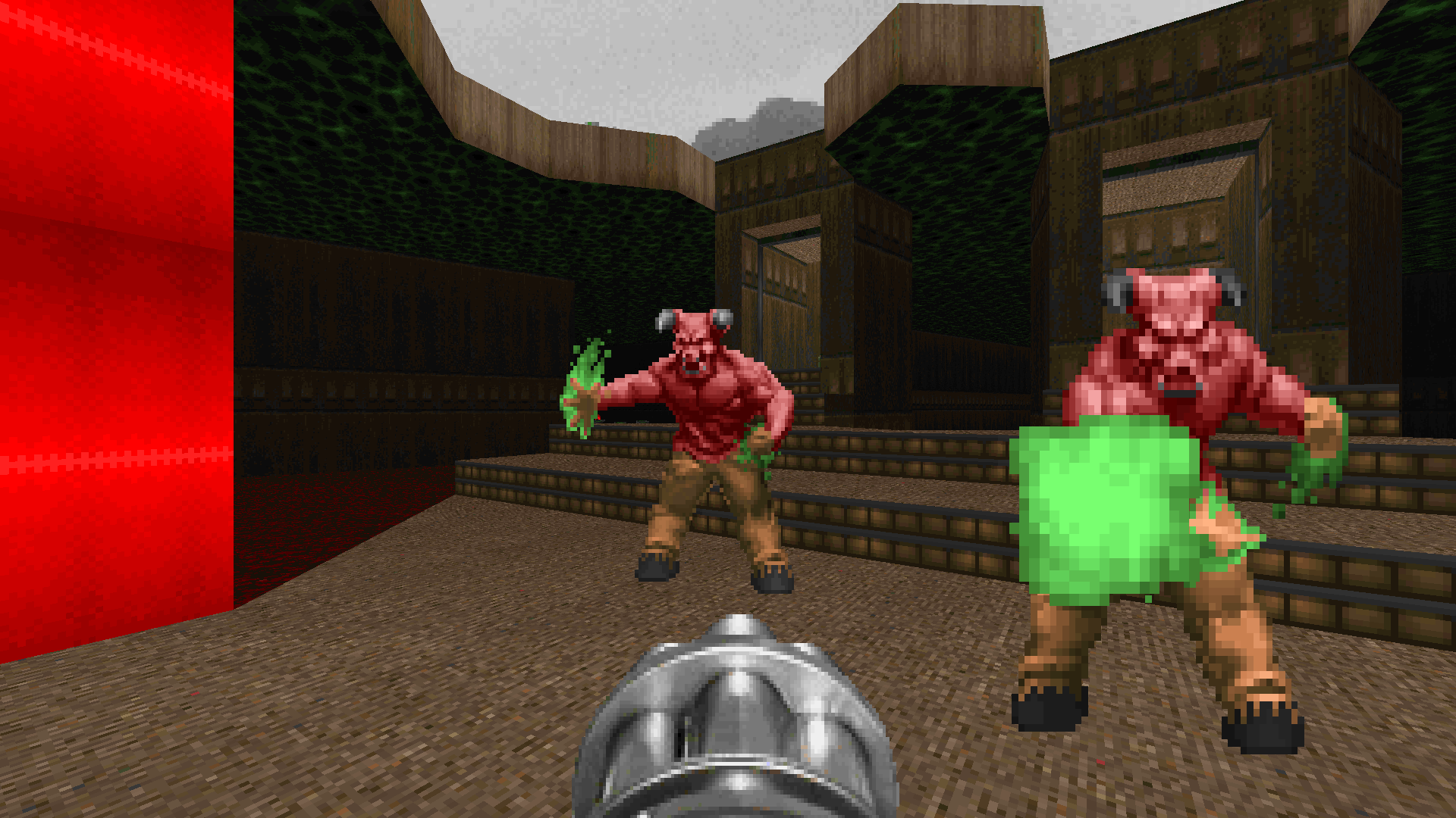
But the reason I’ve delved into color theory now is because my current WAD is for Doom 64, and in Doom 64 all the textures are neutral colors. They’re given life by the colored lighting system, and so for once I have to actually think about what colors I want things to be rather than just letting the textures decide that for me. Will my maps come out looking better than before because of this little bit of so-called research I’m doing? Who knows, but I’m definitely thinking about them differently than I ever would have before, and I’m excited to see where that leads me.
Where would a little pinch of research lead you? You won’t know until you try it.
5. When In Doubt, Give Up
It happens to the best of us. Even yours truly, who regularly churns out full megaWADs over the course of 30 day benders — even I get a case of the ol’ mapper’s block now and then. Now being one of those times, in fact.
So what do you do about it? This is one of the most frequently-asked questions I see from mappers, and I imagine it’s an equally prevalent question in just about any creative field. What do you do when the creativity dries up? Well, speaking from experience, there are only two methods I’ve ever found that work.
Option #1: Buckle down
Open your editor and make anything. It doesn’t matter what it is; just make it. Mimic some real architecture you’ve seen. Try to recreate other maps from memory. Draw meaningless shapes, spell words with sectors, string linedefs around with your eyes closed; it doesn’t matter. Just create. Don’t delete anything as you go. Let it stream out of you with no sense of quality control, no assumption that what you’re putting into the editor will ever be seen by anyone else. This is only for you.
Eventually something will begin to take shape, no matter how horrid. You’ll get an idea how you could place enemies in one area, or how a certain texture would look passable on this wall, or how it would make sense if this one room connected to that other room. We tend to have a much easier time making a map better than we do making a map exist in the first place. Take that real building you tried to emulate and Doomify it. Tear down some walls to open things up. Split some parts into different elevations and add imps firing down at the lower ones. Ditch the supply closet and throw in a secret teleporter. Maybe all you’re looking at in the editor is a big “SOMETHING” spelled out in Doom letters. Okay, connect those suckers together with hallways. Add stairs on the sides of the H leading up to some big powerup in the middle that opens a trap to the north and south. Have the S encircle the O so that it’s all one big arena with a curved tail leading to the exit. Get your initial blocking done by any means necessary, and then keep coming up with ways to make things better until what you have doesn’t even resemble the original scribbles you forced out.
I made it through three UnWADs by resorting to this method on occasion. It doesn’t always make for Cacoward-worthy maps, but it keeps you going until the real creativity flows back to you. And it will. But be mindful that forcing it like this is not necessarily great for your mental health.
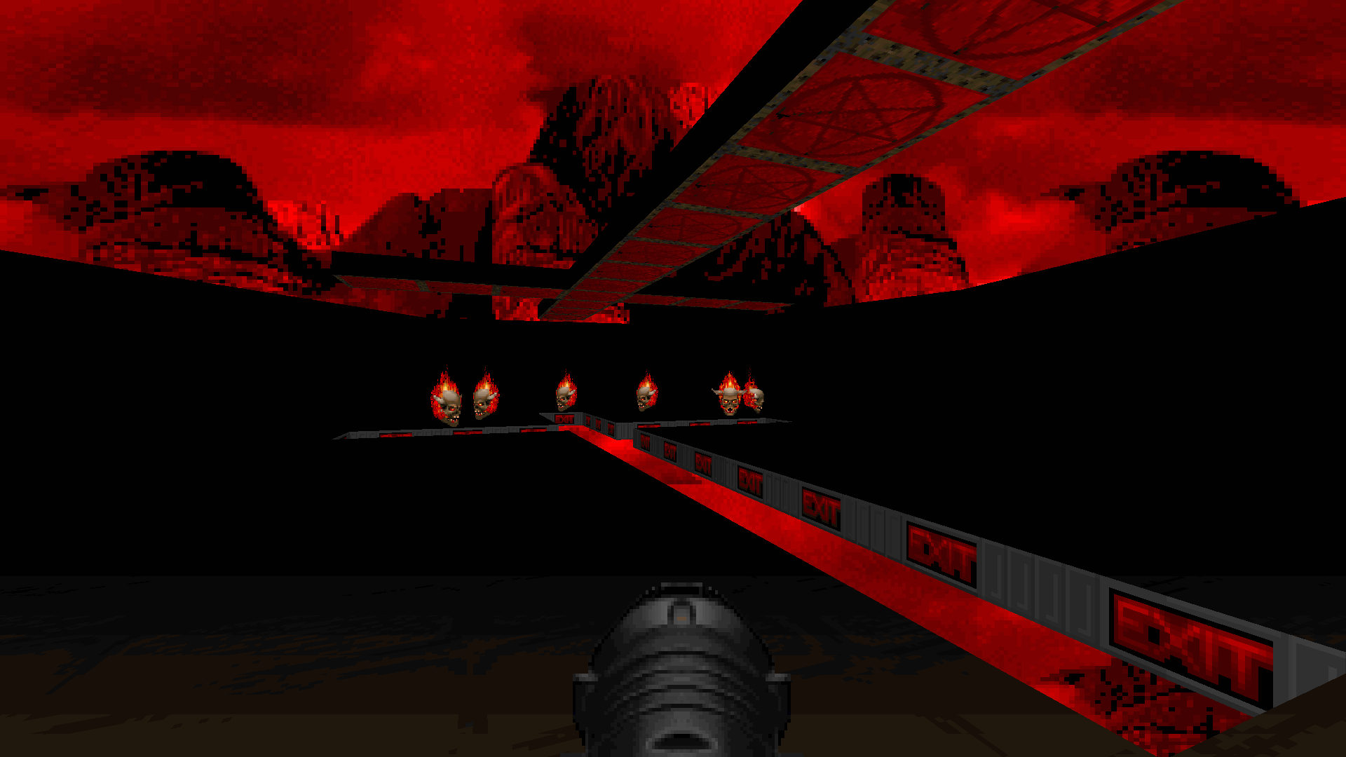
Option #2: Give up (for now)
And here’s where we get back to Knee-Deep in the Dead. Tom Hall left a ton of incomplete maps when he was forced out of id, and they were subsequently finished by somebody else. Your development story won’t be nearly as dramatic, but you can do the same thing with the same results. You can just walk away, and for you the decision doesn’t involve your livelihood. If you get stuck on a map, give up on it for a while. Sure, Sandy Petersen isn’t going to come along and finish it for you… but someone will.
That someone could be a friend who maps too. Recently I hit a wall on a map for an unannounced community project. After weeks of hemming and hawing, I finally agreed to hand it off to a friend on the team so he could work on it for a bit. That downtime let me shift my brainpower to other things and recharge my batteries — and when the map arrived back on my hard drive with new areas I had never considered adding, that was exactly what I needed to jumpstart my creative drive and come at the map from a new angle.
More than likely, though, the someone who comes along and picks up the pieces of your map will be you. It’ll be you, just… not now. Later. The you of the future. The you in a new headspace, with new experiences, having spent time away from the project to focus on literally anything else in the world. That’s the problem with forcing the creative process: often every inch you force it makes the next inch harder. The resistance grows. But sometimes the moment you set your work aside and say, “This can wait,” you feel the physical relief in the pesky parts of your body where tension loves to build without you knowing it.
We have a tremendous advantage over Tom Hall. It’s the same advantage we have over every professional game designer. By the time he left id, Hall had been working for months on a game he didn’t even like anymore. You and I don’t ever have to do that, or let the creative process get to a point of utter frustration for any reason. I don’t know about you, but I set myself deadlines all the time, and every once in a while I have to give myself a good wallop on my thick skull as a reminder that those deadlines are just things I made up. We’re not getting paid for this. It isn’t our job and we’re not going to go hungry without it. We can stop any time we like — because we’re doing this for fun.
As incredible as it would be to make money doing this thing I love… I think of it as a gift, rather than a curse, that it’s just a hobby.
DOOM.WAD unsurprisingly runs on any sourceport you can get your hands on. If you’re looking for more awesome WADs, be sure to check these out!
