I have a problem right now: I can’t stop playing awesome Doom WADs.
I don’t know why it’s taken me so long to check out Mutiny, the 2016 community project that aims to revisit the glory days of WADs like Dysphoria 3, Perdition’s Gate, and my forever-favorite thing in the whole wide world, STRAIN. I’m about two years late to this party… but hey, at least I’m here now.
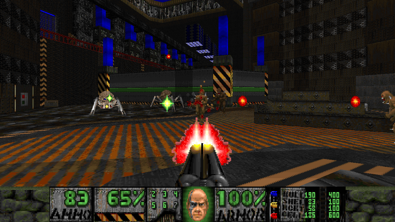
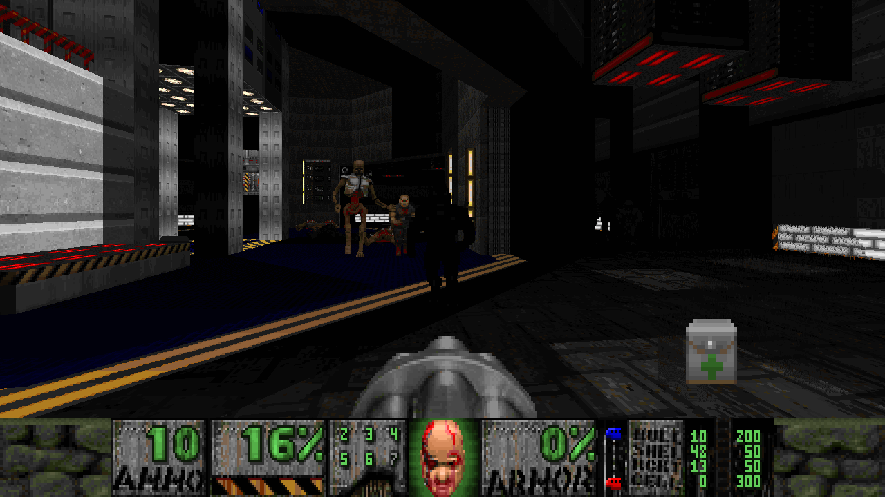
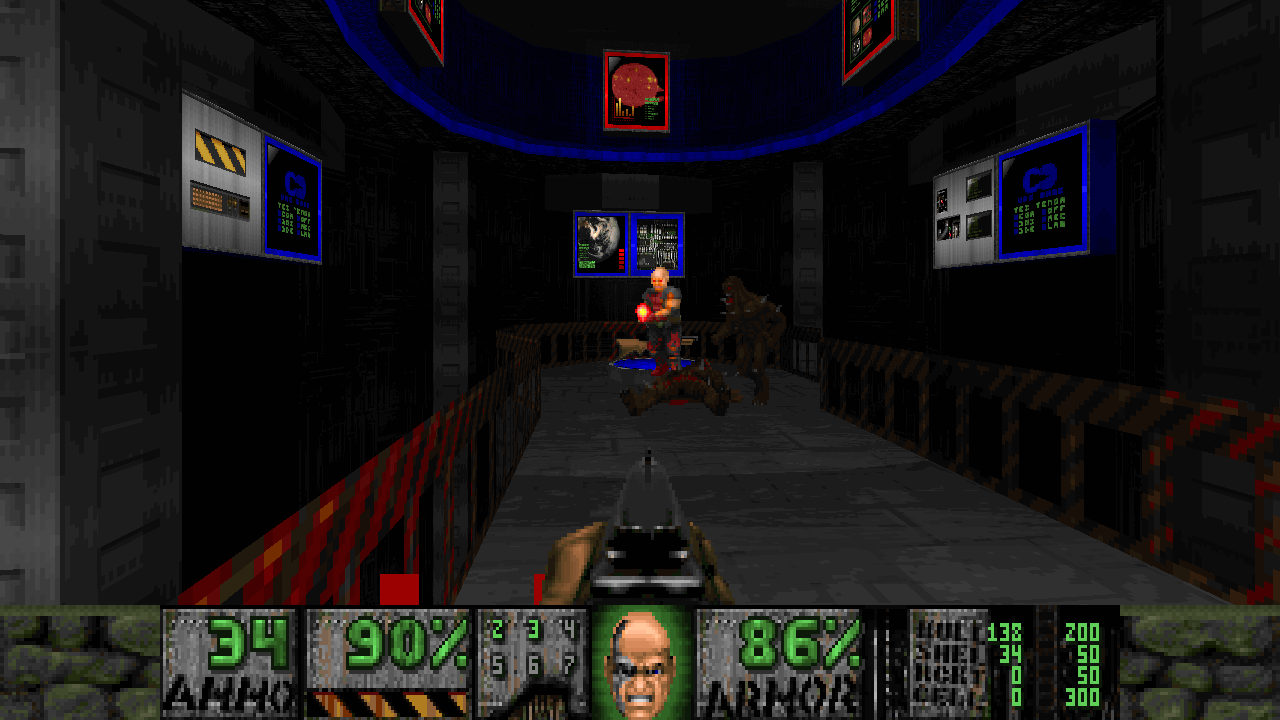
There was a certain flavor to WADs like Dysphoria 3 and STRAIN that just isn’t seen anymore in the world of Doom WADs. I’ve heard a lot of folks call it “cyberpunk” (though that name didn’t seem to fit until I played Mutiny) — characterized by drastic and ubiquitous contrasts between light and dark, colorful and drab, pristine and worn-out… and in the case of Mutiny, cyberpunk’s famed high tech and low life. Mutiny’s goal was to grab hold of that aesthetic thread, which had been cut short in the ’90s, and weave it into the more modern fabric of the 2010s.
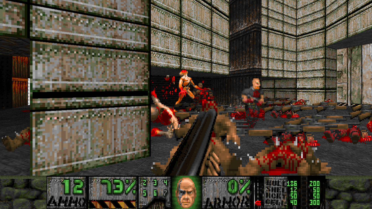
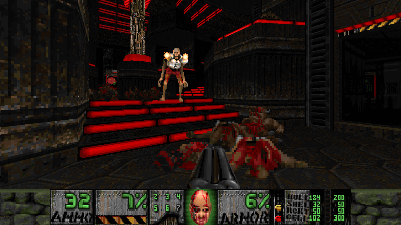
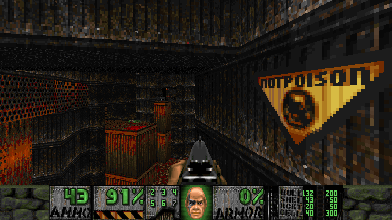
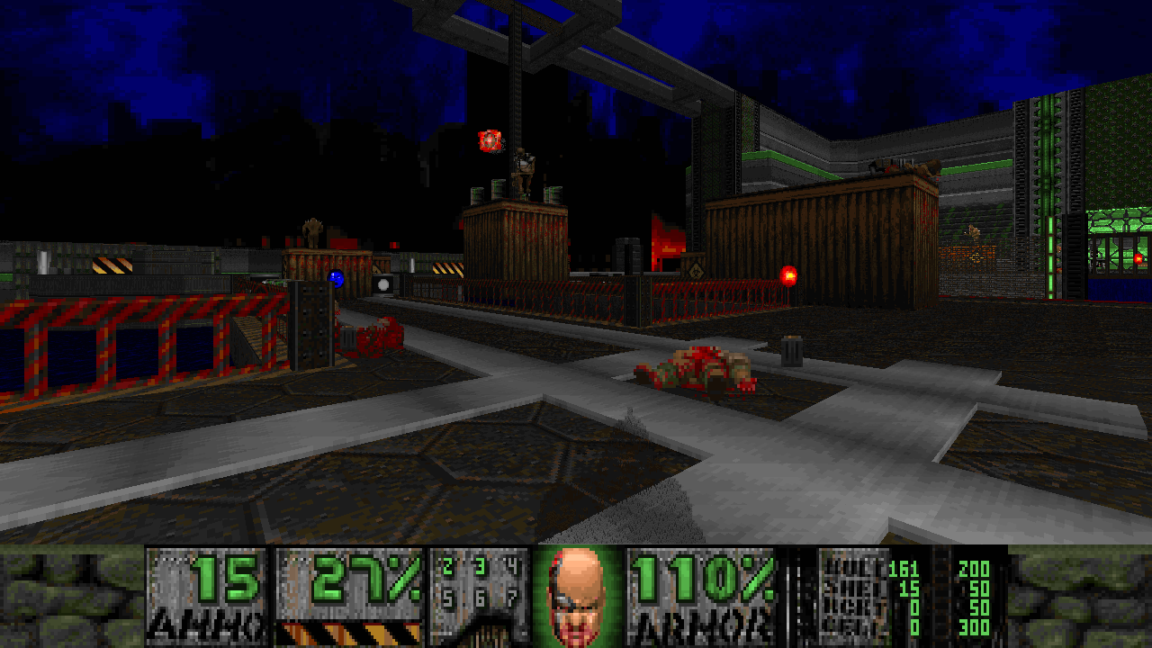
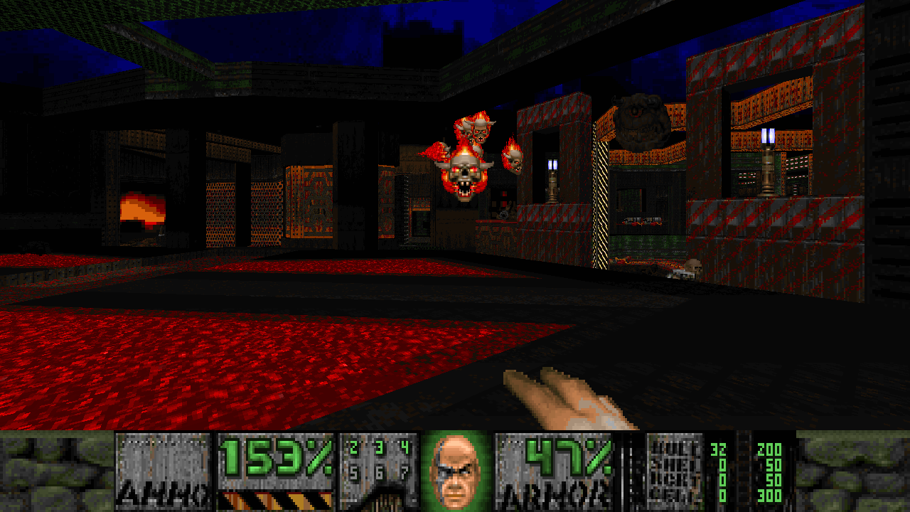
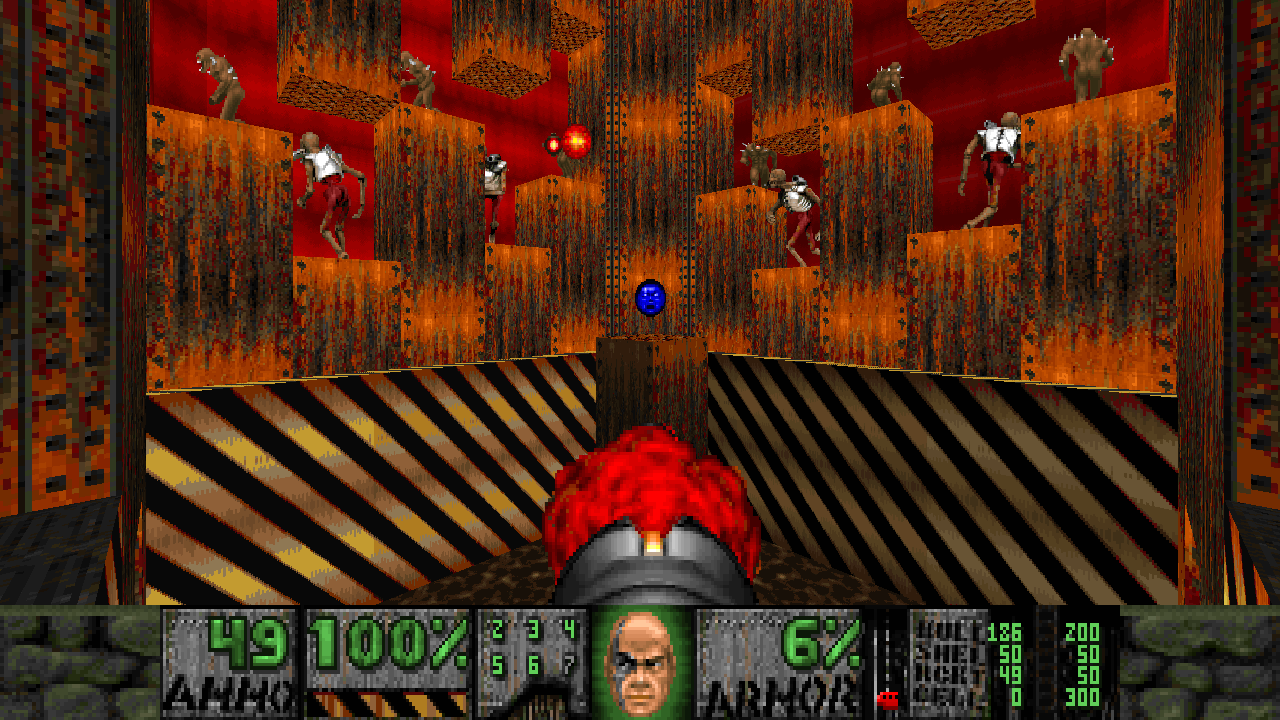
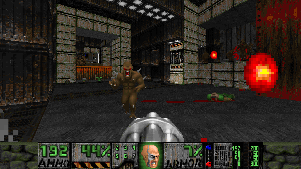
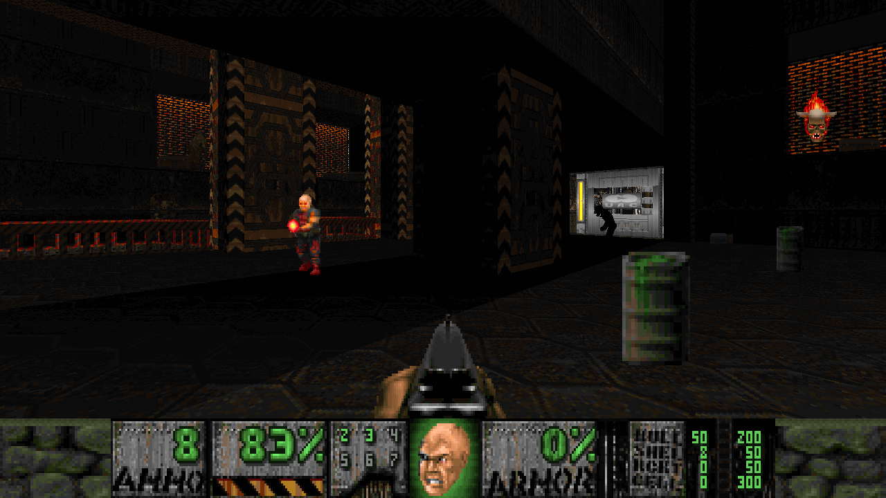
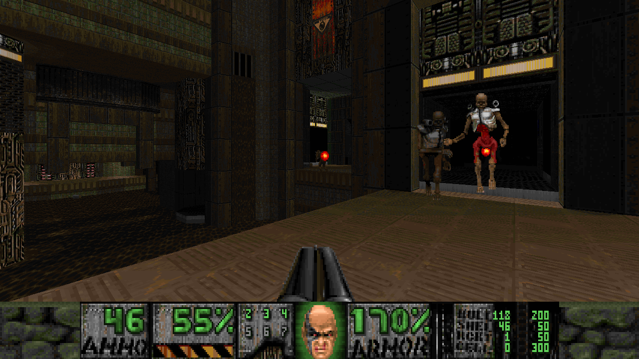
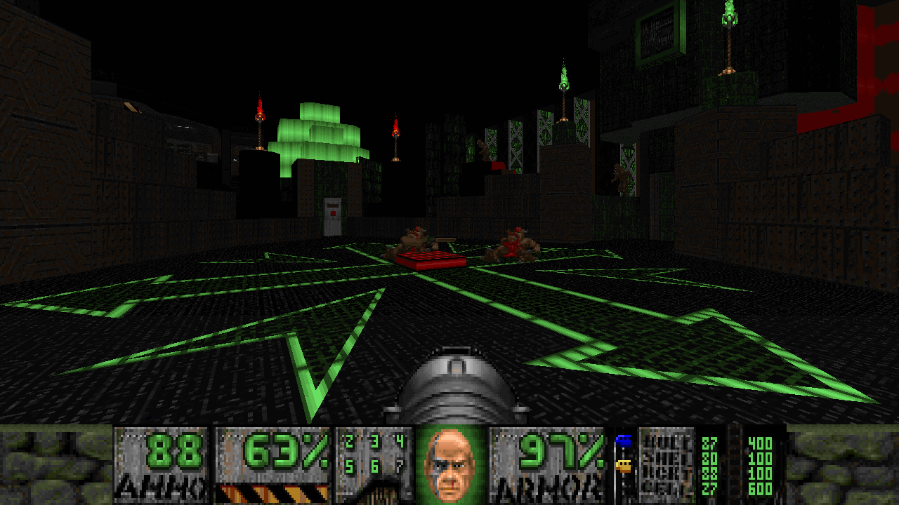
The textureset in Mutiny is nothing short of stunning. Phenomenal. Brilliant. It’s full of brightly-colored neon lights — blues, greens, reds — juxtaposed with rusty browns and grimy greys. Even the pixel work on the textures themselves is often rough and unseemly, but not for lack of artistic skill. The roughness serves as a shoutout to the poorly-edited graphics of Mutiny’s forebears, but it also (I think) purposefully exaggerates the sense of grit and wear — of flaking paint, mottled concrete, and pockmarked metals covering almost every surface.
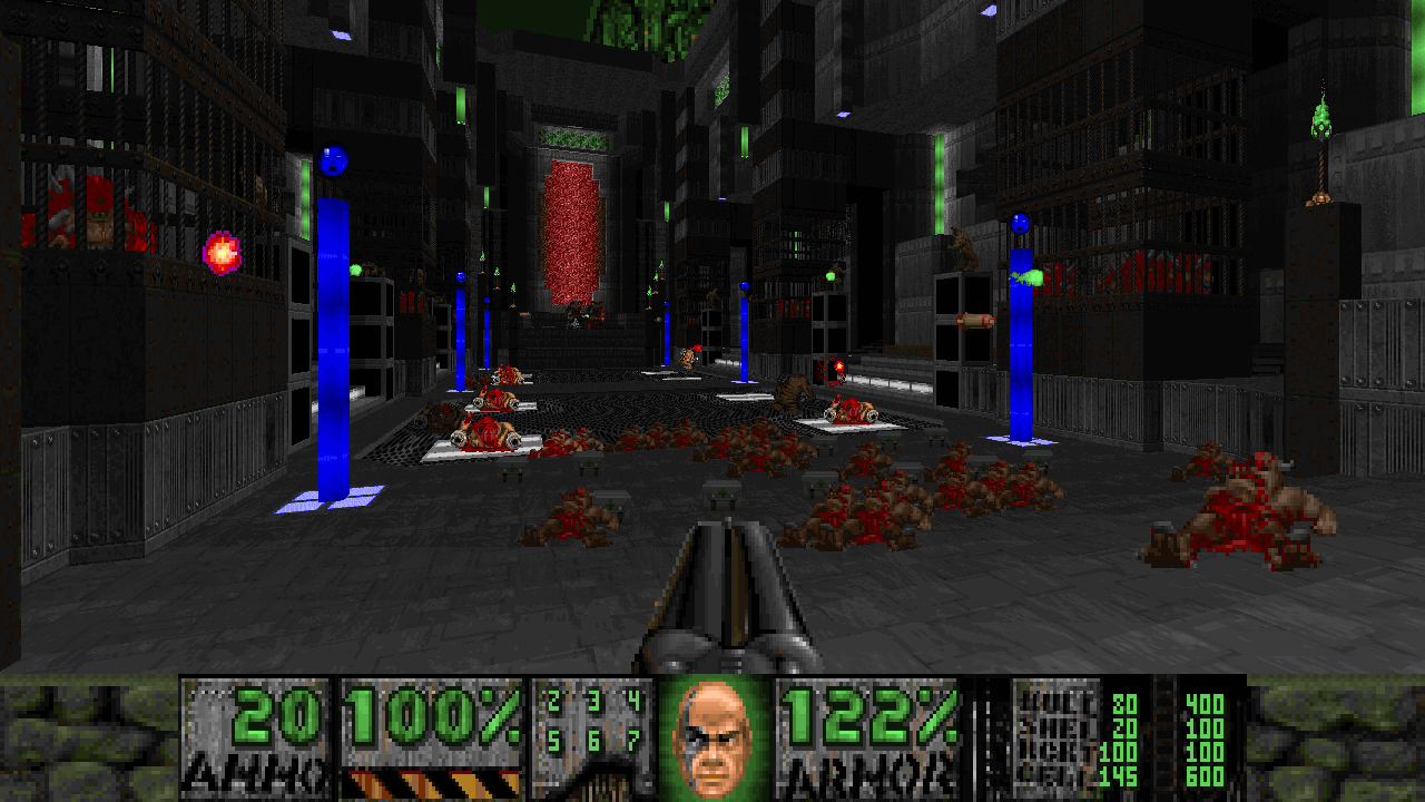
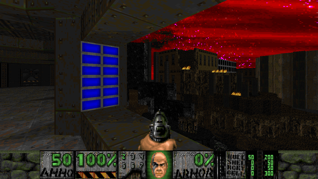
All these incredible resources were pulled together in service of 16 limit-removing maps. That’s part of the modernizing I alluded to: unlike STRAIN and its ilk, Mutiny isn’t confined by the vanilla engine’s hard limits, meaning the maps can be much more intricate and detailed. Most often, that level of intricacy takes the form of some striking vistas and wide open spaces, the likes of which you’d never have seen in the ’90s, and which give the city backdrop of Mutiny a real, believable scale.
The other half of the modernization process involves the gameplay — essentially, making combat more difficult and varied, but also shifting focus from incidental combat to large, trap-based encounters. On that front, Mutiny doesn’t always fire all on cylinders. When it’s putting its exploration foot forward, asking you to search these huge, decrepit, gorgeously-detailed facilities — that’s when the WAD is at its best. I love the incidental combat encounters along the way, which force you to manage resources over the long term: a few chaingunners pecking at you from an elevated perch, a pack of demons closing in on your position, a small monster closet here or there.
Too often, though, Mutiny falls into the same rut as the later levels of Scythe II, or the worst moments of the Favillesco alpha episodes. These are the sorts of fights where most of the difficulty comes from having very little room to move, and where no matter how well you’ve done for the entire rest of the map, one wrong step means you’re surrounded and dead in seconds. I will rail on about how much I hate this kind of encounter design until the day I die, but it seems like a trend that’s here to stay. Mercifully, only a few maps toward the middle of Mutiny really suffer from it, which is thanks in part to how often the maps change up their mission statement.
Mutiny’s maps are not the short kind I always advocate for, but what they are is focused — and focus is really the goal when I talk about short maps. There’s no fluff here. No filler. Every map knows exactly what it wants to be; it gets in, achieves that mission, and then gets out. And that mission changes as often as the map numbers do.
Just as the maps seem to be becoming long and exploratory with a masterpiece like Faceless Corporation, it’ll throw you a small-scale, fast-paced action map like Bunker Base. Then there’s something like Slums, a brilliantly-realized impoverished city block where the challenge stems from navigating the maze left behind by decades of construction built right on top of the previous structures. Brief openings above give the player glimpses of highways or high-rises, all while you’re squeezing through gaps and rat holes so cramped that you feel like you’re forcing yourself into unintended paths through the map. And there’s my favorite in the mapset, Compactor, which is all rusty metal and deadly crushers, where no spot is safe. Props again go to the fantastic texture work for selling the grungy, gross inside of a waste disposal center. It’s pure oldschool mapping, with the devilish fakeout that the lava floors don’t actually damage you — and you’ve been blitzkrieging over them for no reason.
Oh, and the finale, The Brain — a wonderful melee of insane proportions with enemies constantly denying certain areas to you but never boxing you in to an unfair degree. During the climactic battle, ammo is in one location and healing items in another, so you’re forced to make trips back and forth, rather than getting comfortable in one spot. I deeply appreciate the map’s restraint when it comes to the small side rooms you need to get to in order to flip switches. These would be the perfect opportunity for an annoyingly-cramped teleport trap to be sprung on you, but instead they’re these quiet, safe little havens before you head back out into the fracas. True, I’d hoped to see a custom final boss to cap everything off, but the way you end up finishing off the titular brain more than makes up for it. In 25 years of playing Doom, I’ve never seen anything quite like that.
To make these 16 maps happen, Jon “40oz” Vail wrangled over 20 mappers. If that number looks like a typo, I assure you it’s not. There were more mappers on this project than there are maps in the final product, with almost every map being a team effort. I often think of it as one of Doom’s strengths that a map can be thrown together by a single creator. In contrast to newer games that require multiple passes — someone doing the initial design, someone working on scripting, someone fiddling with the lighting effects — a Doom map is often the result of a sole person’s creative vision. So it’s an odd choice to force all your mappers together where they could butt heads, or their creative impulses could potentially conflict. But 40oz, to his credit, was either a born mapper-wrangler or he knew exactly which mappers would work well together. He brings to bear the strengths and individual styles of two dozen mappers, all the while maintaining a unfailing voice for the entire project.
Not every map in Mutiny is a winner, but every one is undeniably beautiful, well-constructed, and thematically consistent. For the most part, you can’t even tell that they were touched by multiple sets of hands. There’s a clear line of delineation from the first to the second half of Map04, but that’s the only map I can think of where I could see the difference between the work of two different mappers.
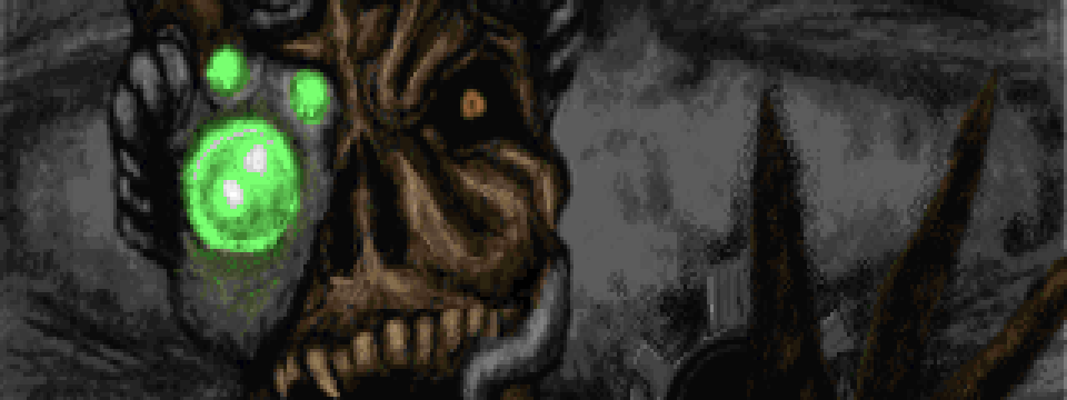
It probably helps that the new textures do a lot of legwork in creating a strong personality for the WAD, which the mappers could all build off of. (Did I mention these textures are amazing?) I can’t say enough good things about the graphical additions to Mutiny. So much so that I wish just as much attention had been paid to the weapons and enemies. A couple custom monsters or a new weapon would have cemented Mutiny’s unique identity, but even just a few reskins similar to what was done with Avactor would have gone a long way. We even got a peek at how a more cyberpunk-y revenant would have looked in the title screen!
Mutiny is a triumph. Like any community project that had this many contributors, there are going to be some rough patches. But the look and feel of this thing hold it together better than any industrial adhesive. Even as the world’s biggest STRAIN fan, I honestly don’t think STRAIN could have hoped for a truer successor. Still, Mutiny is its own creature, and it’s a creature that stands strong on its own merits.
I mean, look at these dang textures!
Mutiny requires DOOM2.WAD and runs on limit-removing sourceports. If you’re not sure how to get it running, this may help. And for more awesome WADs, be sure to check these out!
