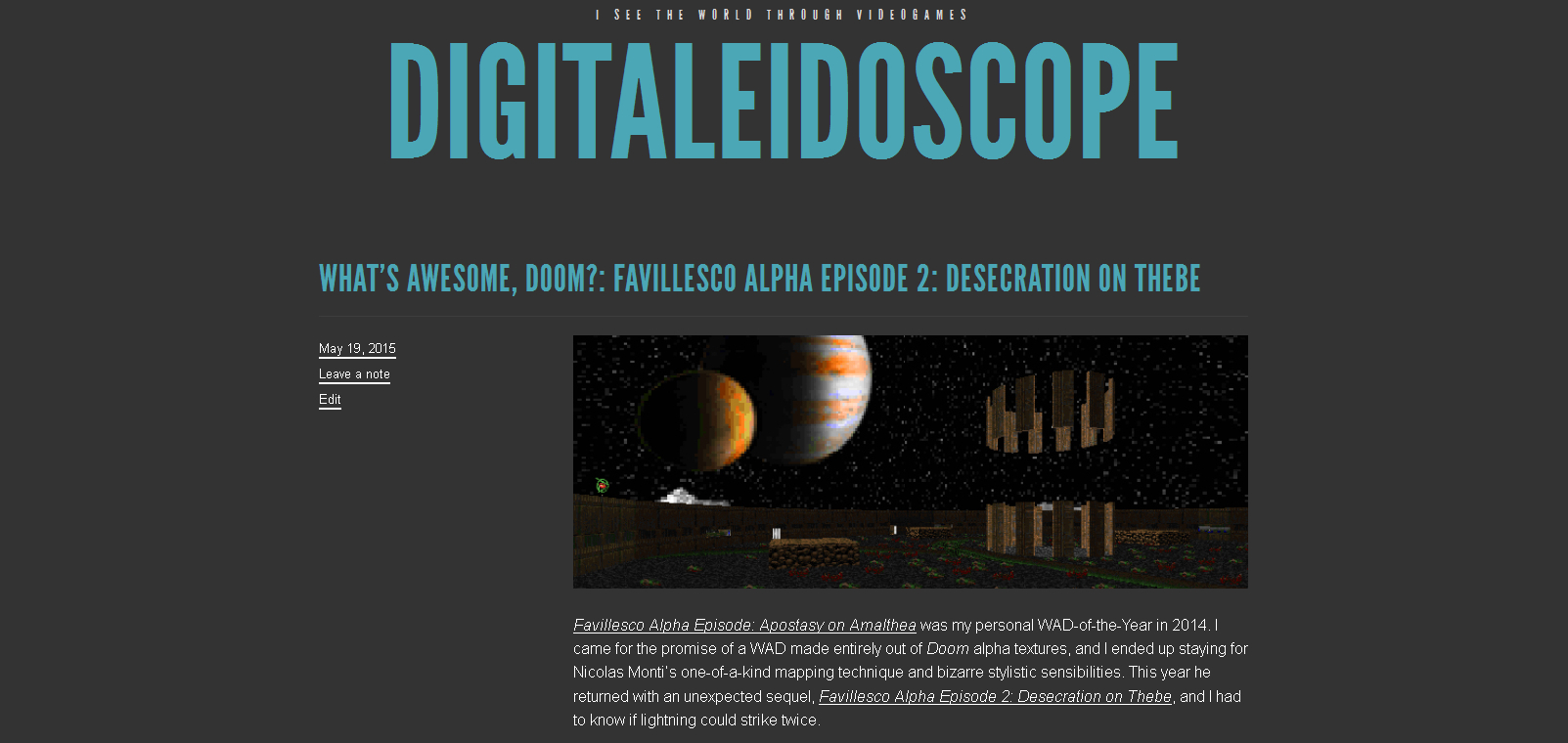
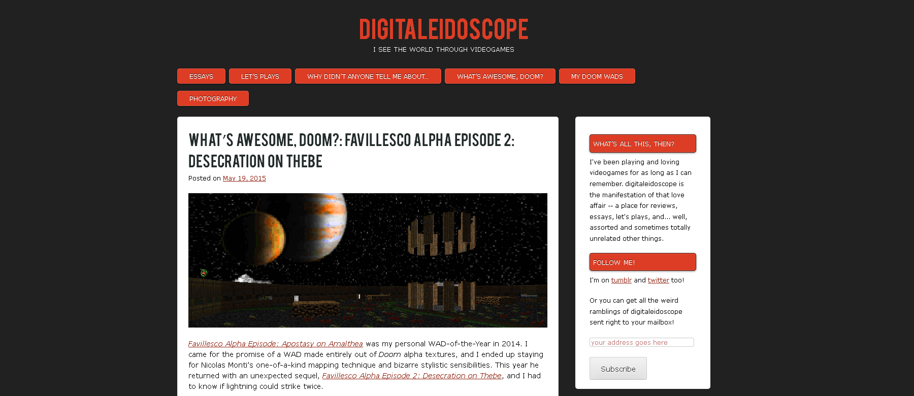
As you may have noticed, digitaleidoscope has a new coat of paint. I tried and fail to tweak the old TRVL theme to my needs, but I just don’t know enough about CSS to really do much. Aplos, on the other hand, by default has better placement of widgets, allows me to display my pages right at the top, and even has an orange (yay!) and grey palette. So it was a no-brainer.
Since I try to keep a record of what the blog has looked like over the years (really just for my own future curiosity), here’s a comparison…
The old look:
And the new:
While I’m messing about, if you have anything you’d like to see changed or any features you’d like to see added, drop a comment here and I’ll see if it’s possible.

