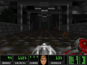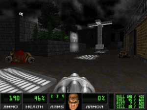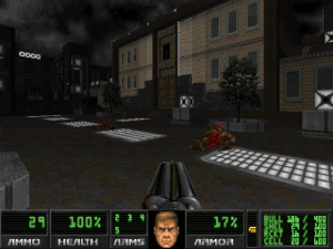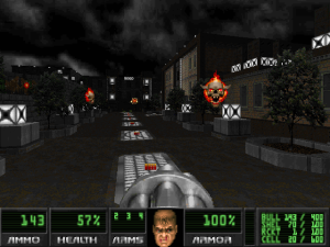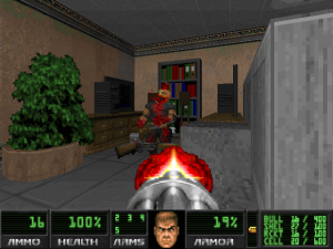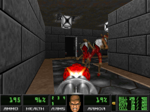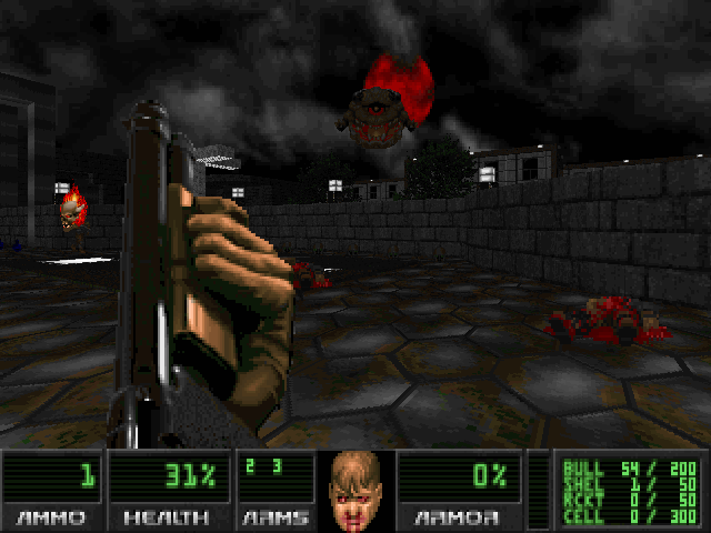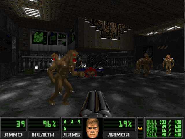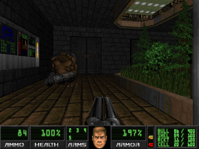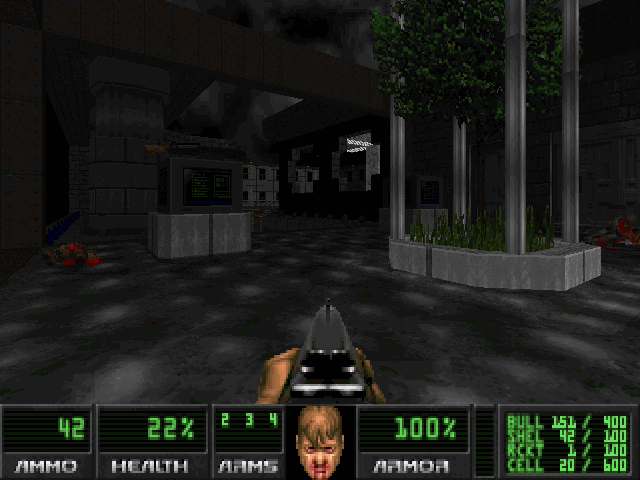
Lainos won a Cacoward back in 2012 for his massive, atmospheric WAD, 5till L1 Complex. He’s back this year with a semi-sequel called Deneb Colony, a much smaller, more straightforward level that inherits almost nothing from its predecessor other than its visual style. That said, if you’re one of the many Doomers who loved 5till, there’s a good chance you’ll enjoy Deneb. If you didn’t, though, definitely don’t dismiss Lainos’ new work as more 5till. I was in the minority as someone who didn’t really care for 5till, but Deneb Colony had me enthralled from beginning to end.
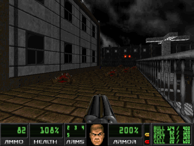
Doom has few well-realized urban settings, but this is one of them. Deneb has you exploring what seems like it might be the upscale business district of the Deneb colony: a large office building, a factory of some sort, and pedestrian walkways dotted with trees and small gardens — all of it gorgeous.
Aesthetically, Deneb may actually be a stronger work than 5till. While 5till had a uniquely barren, haunting beauty to its ruined environments, it was also marred by a lot of empty-feeling locations and cluttered, visually chaotic wilderness sequences. Deneb, in contrast, is completely intact and pristine. It’s spotless and recently landscaped; and when you arrive, it feels like the demons only got there moments before you did.
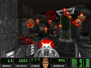
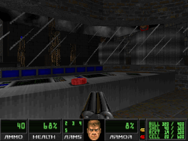
The design is more crisp and focused on this offering. Despite the map taking me almost forty minutes to finish, it actually doesn’t cover that much physical ground. The smaller space seems to have allowed Lainos to apply a ton of polish, with the open, outdoor part of the level looking especially impressive. The dark sky and low outdoor light levels of 5till are back, and the whole thing has a very distinct style: clean white light sources set against the dark greys and browns of the “natural” light. And the red-hot projectiles and fiery lost souls stand out against it all beautifully.
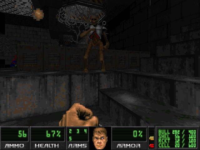
There’s a bit of a drop in quality once you get inside, though. It feels like Lainos agonized over the details of the central area but then rushed a little on some of the following parts. That’s not to say they look bad, only noticeably less detailed. The only time Lainos’ mapping doesn’t look so great is in the office building, where the Doom engine — as usual — is just not capable of making desks and chairs and computers that look anything close to convincing.
Deneb also (thankfully!) ditches the redrawn weapon sprites from its predecessor — most of which were ugly, misaligned, and took up too much room on the screen — and leaves all the weapons with their vanilla look. It’s a vast improvement.
The return to classic Doom weapons doesn’t actually affect the gunplay at all, but it’s sort of a metaphor for how Deneb goes back to its Doom roots gameplay-wise. Since I seem to be endlessly comparing Deneb to 5till, I’ll say the gameplay is also tighter here, but saying that it’s tighter makes it sound better — and that’s not really what I mean. Really, Deneb plays closer to a traditional Doom level than 5till, and trades all the exploration of huge landscapes for linear fight-monsters-find-key-open-door-fight-more-monsters fare.
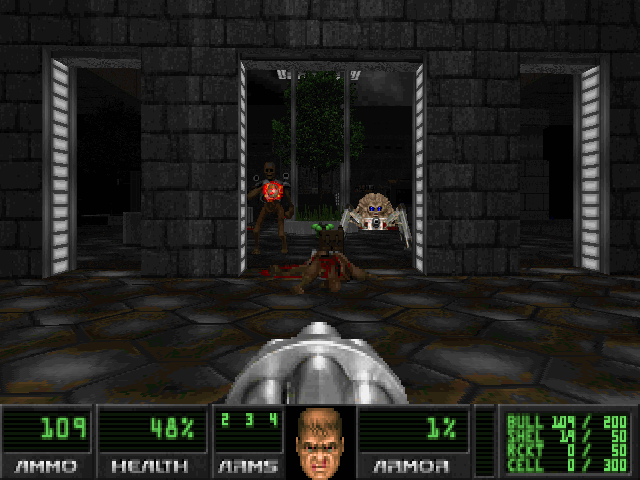
Don’t think it’s easy — or predictable. The monster placement and difficulty curve are quite unorthodox: some serious ammo scarcity for the first couple minutes and a lot of the difficulty front-loaded into the opening handful of fights. Most of that difficulty comes from pain elementals, which Lainos places more liberally than any mapper I’ve ever seen. They appear in such large numbers early on in Ultra-Violence that if you don’t immediately kill them, the level can end up unwinnable simply because the cloud of lost souls prevents you from moving.
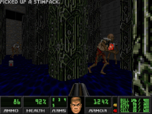
On lower difficulty settings, many of the elementals are replaced with cacodemons (and arch-viles later in the level replaced with revenants), which makes everything a lot more manageable. Battles and environments are still varied and present a number of different challenges, though the only super touch-and-go moment I had on Hurt Me Plenty was an incredibly tense fight with a horde of revenants among a forest of tech columns. (Sadly, the cyberdemon duo who pop up in the conclusion of the level can be ignored completely.)
The watery pit above is also home to a really bizarre part I’m still not sure I did right. There’s a switch that raises the water level, which you need to ride up and out of a pit, and another that lowers it again in case you screw that up. Thing is, you’ll be using that second switch a lot, because the only way I found to get through this part is a tricky straferun where you get a running start, press the first switch as you strafe by at full speed, and then bolt onto the rising floor through a small gap before it closes. It felt so unintuitive that I was sure I was breaking the map, but I don’t know how else you’d do it.
It’s an unfortunate awkward moment in a WAD that’s pretty sound in all other ways. Lainos may not defy any genres the way he did with 5till, and maybe this one won’t win any Cacowards, but I wouldn’t count it out. It’s a WAD that looks stunning and plays fantastically, and if you’re looking for some punishment, setting it on UV should give even the hardcore a run for their money.
Deneb Colony requires DOOM2.WAD and should run on any Boom-compatible source port that supports OGG music (PrBoom+ or Eternity, for instance). If you’re not sure how to get it running, this may help. And for more awesome WADs, be sure to check these out!
