I have a theming problem. With this blog, I mean. I also don’t have a very good eye for design.
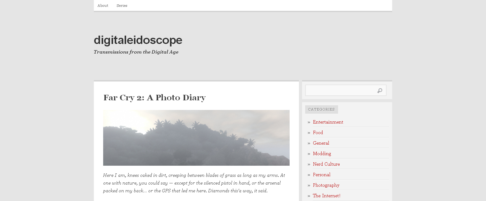
I had originally planned on going a while without caring, but that didn’t pan out. For some reason, people started reading this and then I suddenly felt like I had to make the place look nice. So I ate through half a dozen themes in a couple weeks before finally settling on one. Believe it or not — once upon a time, we looked like this:

It was simple, which I’m a fan of, but it also had no character… or color. Hilariously, at the time WordPress allowed you to change the color of that strip of slightly darker grey at the top of the columns. So you could inject some color, just… so little and in so meaningless a location that it made the whole thing look even more drab.
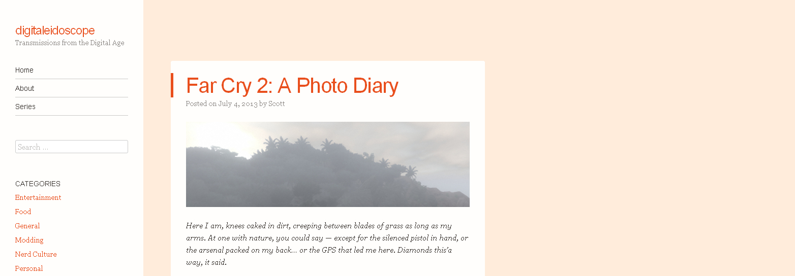
Which eventually led me to the current theme. Lots of orange (or green, when you mouseover links), and I could get rid of the background image and replace it with a nice, solid color to keep things simple. For posterity, this is what we’re looking at right now:

Which ain’t bad. But it’s always bugged me that everything is shoved over to the left. Feels lopsided. That, and I prefer the sidebar to be on the right of posts for some reason. It just seems backwards the other way. And I’m starting to get antsy now, having had this look for over six months. I’m ready for something new.
So I’m on the lookout again. And of course, I can’t make up my mind. Not just among the rather limited options, but in general — about what kind of theme I would want if I could design my own from the ground up. Do you go for the ultra-simplicity of a Chunk (which works quite well for fellow videogame-talker-abouter Joel Newman), or maybe a nice splash of color and a not-too-distracting background image like Shamus Young‘s got going on?
Granted, while I consider this a videogame blog to a large extent, I do spend a heck of a lot of time talking about other weird and eccentric topics. So maybe the programmer/engineer-esque desire for simplicity is misplaced. Should the theme reflect the eclectic nature of the blog? Maybe, but I have no idea!
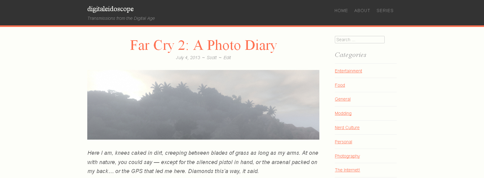
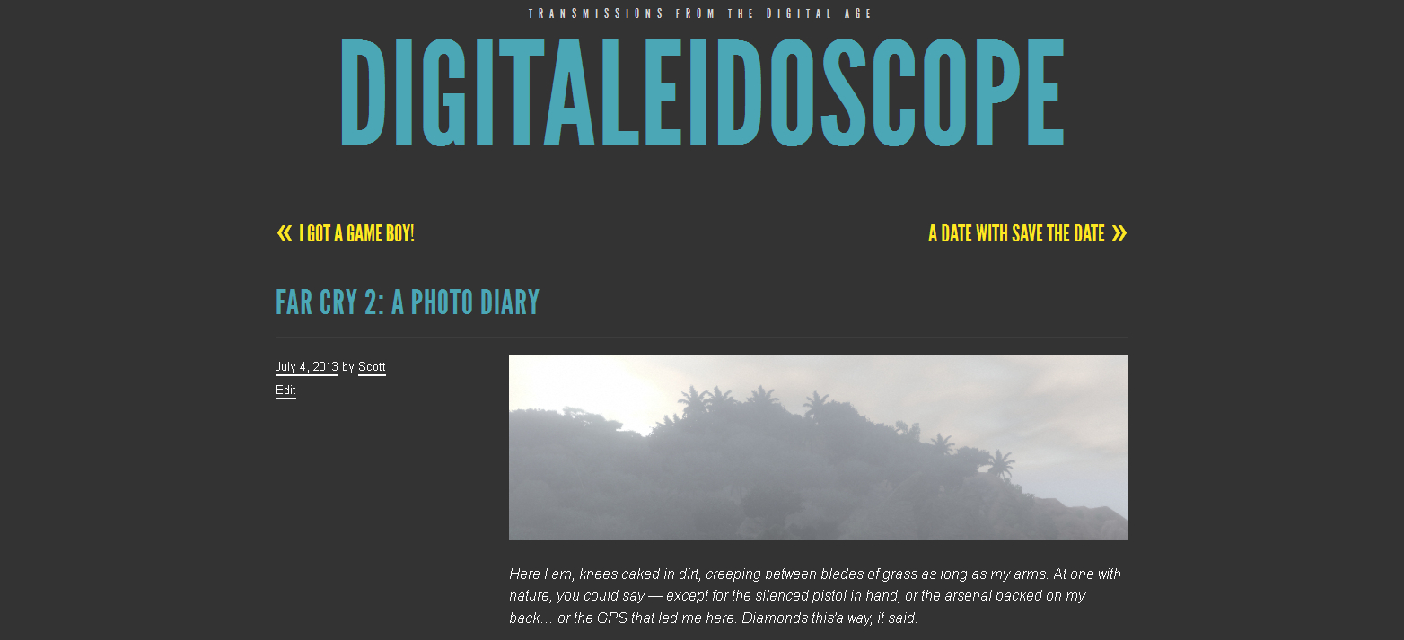
These are two of the options I’m considering:

Panel: For if you can’t part with your old orange theme. I like the extra-wide look of this one, but not the way it makes the plain text of the posts look bold. Or how it centers titles. But it’s orange!

TRVL: Which is super simple and has a good amount of color, but the header is a little LOUD and the subtitle goes above the title which seems to defeat the purpose of a subtitle.
Of course, most of my little complaints with all of these themes could be fixed with some quick edits. WordPress, however (of course), only allows people like me to change two colors: the background and one element (which is usually color-coordinated with some other element, so being able to change the one but not the other… is kind of pointless). Basically, it’s a way of teasing you so you’ll pay for the ability to edit the whole theme, not just a couple color values. Which might happen eventually.
Someday, WordPress. Someday.
Anyway, though — like I said, design is not my forte. What do you think? What do you expect a blog like this to look like? What kind of designs to you like the most? Keep it simple or no? Color or plain? Stop worrying about themes and write something more interesting?
Okay, okay! I admit this was mostly an excuse to write a post aimed at future me — so he can see how goofy this place looked back in the good ol’ days.
great post and themes. i like it.